Overview
So I’ve been experimenting with the ways you can do cel-shaded posters in SFM, and I think I developed a solid SFM artwork pipeline that is easy enough to follow (given that you are quite familiar with both SFM and your photo-editing software). It’s nothing too complex really, but there doesn’t seem to be many cel-shading guides out there, so I decided to make my own.
A few words before we begin
A few words before we begin
Introduction: a bunch of theory
Introduction: a bunch of theory
Cel-shading
Cel shading is basically a stepped transition from highlight to shadow. It’s a common shading technique in drawing:

You should be familiar with it since TF2 also uses cel-shading on most of its models and I feel like 99% of the SFM userbase worked with the TF2 assets at least once 🙂

Outlines
This one should be easy: it helps differentiate the object from the background. AO-based outlines in SFM are pretty garbage, but it’s not like we have any alternatives aside from drawing them manually in post

Random trivia:
There are 2 methods of doing outlines in 3D (at least these are the ones I’m aware of lol): adding outlines after rendering the image based on the normals information:

…and using so-called “inverted hull method”.
The first one is pretty self-explanatory, so let me talk about the second one. It’s done by extruding vertices of the mesh along their normal directions, inverting the direction of the resulting faces, and making them pure black (or the other color you need). So you’re rendering outlines alongside the model.
Here’s my port of Dust from Lethal League Blaze as an example:

If you look carefully, you can see that the outline is essentially a thicker copy of the model with a pure-black color material.
Dunno which one of these SFM uses, but I’m guessing the first one since the outlines in SFM are all the same width regardless of the distance of a model from the camera (click on the images to zoom in to see the difference):
(SFM outlines vs inverted hull method outlines baked in the model)


Cartoon-ish characters proportions and styling
The point I’m trying to make here is that the character you want to make a render of should be created with the cartoon art style in mind. Cel-shading on TF2’s mercs looks good because they were created with the toon style in mind: they have exaggerated features and textures that were created according to the strict art guidelines[polycount.com] that focus on simplicity. A super-cartoony shader on a realistic model (say, Gman from Half-Life: Alyx) wouldn’t necessarily look bad, but kinda weird at the very least.
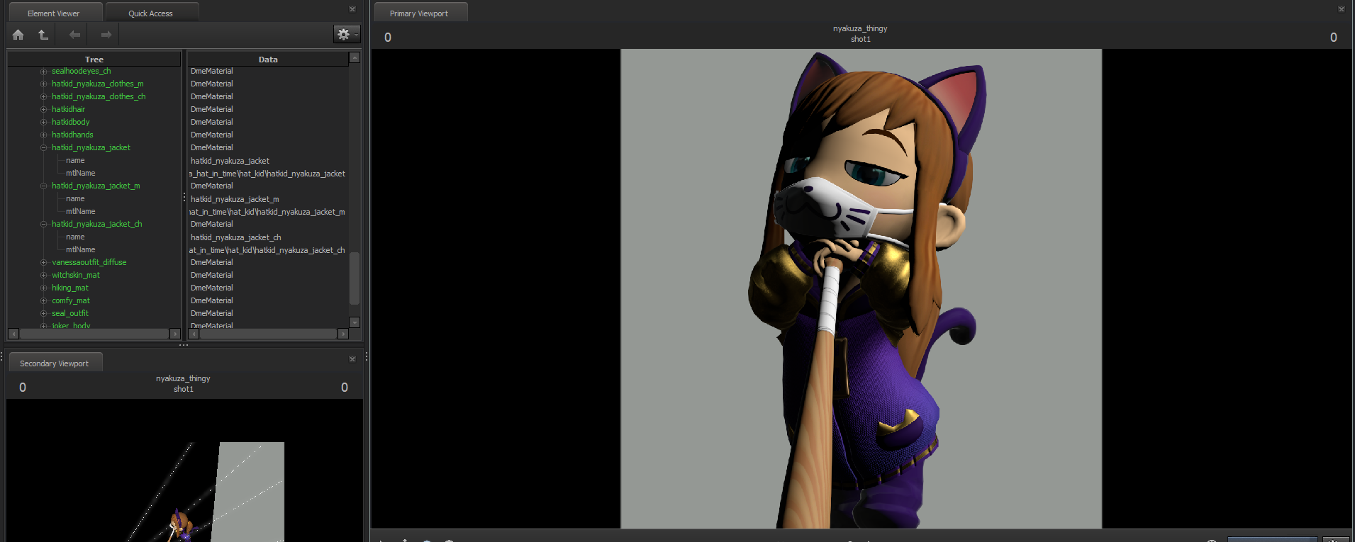
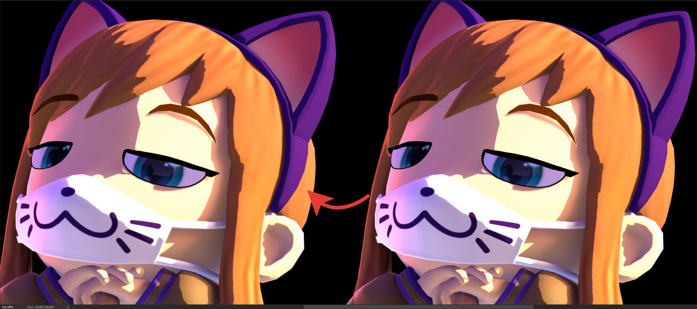
So I’d recommend hiding all bump maps and env maps on your materials before rendering. They create additional detail that we don’t need in our case.
Here’s an example of disabling fake pbr and normal mapping:
You can also try repainting the textures to be more cartoony. TF2’s texturing guidelines work great with cel-shading, so you can use them as a reference.
Quick and dirty way: using $lightwarptexture
Quick and dirty way: using $lightwarptexture
The Chad way: SFM part
The Chad way: SFM part
1. Masks for cel-shading
We need to manually mix highlight, mid-tones, and rim lights in the photo-editing software (I’ll be using Photoshop). To do that we need 3 masks. We’re going to make them using extremely bright lights.
All of my lights below have:
intensity: 1000000 (you need overwrite light’s intensity max value)
constantAttenuation: 1
shadowAtten: 0
shadowDepthBias: 0
radius: ~10

(note the yellow eyebrow: we’ll need to fix it later in post. We want all of our masks to be grayscale)
radius: ~80

It’s practically a copy of the highlight mask, except with much heigher radius.
radius: 0

Naturally, you don’t have to make your lights exactly the same as here. Experiment with radius and shadow size!
All unmasked space is going to be shadowed.
Note that materials with env mapping, rim lighting, or emissive properties can result in inaccurate masks!!
We can reduce render times and save some hard drive space by making these masks pure red, pure green, and pure blue, and rendering them in one go:
In Photoshop, by holding ctrl and left-clicking on one of the channels in the “Channels” window you can select all of the white areas in it. We can use that selection later as a mask.


2. Base lighting layer
This is going to be on the bottom of our layer stack. Just make your regular soft lighting setup using high-radius lights. Take positions of your masking lights into account while doing that: place your key lights where highlight mask is and rim lights where rim mask is.

I won’t get into detail on the lights here, check out this guide if you’re having trouble with lighting:
[link]
In short, there are 2 key lights with sharpest shadows and radius set to 150, 1 ambient light above with radius set to ~380, the same one below with color changed to act as lighting bouncing from the floor, 2 fill lights with disabled shadows and radius set to 400 and 2 rim lights with soft shadows with the radius set to 75.
3. Highlights and mid-tones layer
We’re going to use our highlight and mid-tone masks on this layer. Duplicate the base layer lights and make the highlight wider:
I disabled rim lights to keep precious shadowed light cap low since they’ll get masked out anyway.

4. Rim lighting layer
We’re going to use the rim light mask on this one. Once again, copy your base lighting setup, but this time make your rim light bigger:

Misc renders
You can also render the outline layer. Outline width in SFM is sadly fixed, so the only way to change it would be to later during post-processing select the outline, expand the selection, fill it in with black, and then do some clean-up.
I’ve also made a mask to cut the character from the background:
See this guide to learn how to do it:
[link]


The Chad way: Post-processing part
The Chad way: Post-processing part
Smoothing edges
So there’s a really cool feature in Photoshop for this kind of stuff called “Select and Mask”. It lets you fine-tune the sharpness of your selection, which is exactly what we need:
Naturally, it’s not perfect, but it can save you a ton of time by smoothing all the small-scale roughness

Since we use masks, it’s easy to manually fix troubling edges and paint in some shadows or highlights. I recommend using a drawing tablet if you have one.

Outline
Outline in SFM is kinda shallow, so usually I change levels to bring out the blacks more
I’m also gonna make the outline a bit thicker by selecting it, expanding the selection, and filling it in with black, plus some clean-up afterwards:


If you can’t decide whether to keep the outline or not, you can try tinting it with the near-by colors of the character:

Color correction, bloom, and final touches
I’ve always done color correction by an eye, dunno any rules :D. My advice – play with it until it looks pretty to you. Eventually you’ll get the hang of it.
If you’re using Photoshop, I recommend color correcting with the Camera Raw filter


It’s very easy to make bloom during post-processing: create a new layer, color pick the brightest parts of your image, and draw onto them using hard brush. Then blur this layer, adjust it’s opacity to your liking, and you’re done! Be careful and don’t overdo it tho

We’re almost done, so it’s time to do some final touch-ups. Here I fixed minor clipping issues, fixed some mask edges, tinted sleeves with a goldish color, and brightened eyes a bit.
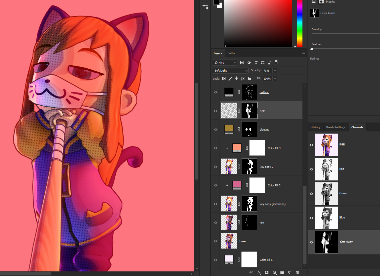
The other cool thing you can do is add a layer of dots to give the whole thing a vibe of comic book art. Select your character on the base layer, and exclude areas of your selection that collide with the highlight, mid-tone, and rim light masks. This selection should cover all shadows on your character. Now feather the selection and use it as a mask for your dots layer, which should be right below the outline layer.
[link]
Here’s a 2k image of dots if you’re too lazy to make one yourself 🙂

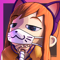
I didn’t have a specific background in mind for this poster, so I went with a simple one (also because I’ve been doing this for 2 days and I’m already getting tired of this ♥♥♥♥)
AND WE’RE DONE!
Random tip:
If you have banding issues (visible stripes of color instead of gradients that supposed to be smooth), try making a noise layer, setting it to “Overlay” and lowering the opacity to something like 10%. This should help get rid of banding, but it’s gonna make your final image take up more hard drive space.


Closing words
Closing words