Overview
Most resources for Automation focus on engineering. Here’s the first guide focusing solely on aesthetics. Consider this an introduction to making your cars look pretty.
Introduction
I once had the privilege of providing Automation’s number one Steam review. In it, I briefly discussed how the game helped pull me back into the world of automotive design. But I’m a journalist, not an industrial designer, so I might as well share my trade secrets if I’m not in the trade. I’ve used Automation to create some very pretty vehicles; with the help of this guide, you will be able to as well.
This guide will discuss and explain five principles of automotive aesthetics that a designer should always keep in mind. I will refrain from using community examples so no one gets singled out, but I will be using real-life examples and my own creations to demonstrate how to apply these ideas in Automation. From what I’ve seen under the Community Content section, most players almost have this stuff figured out, but could benefit from a bit of refinement. My hope is that this guide will give you the polish you need to make your designs shine.
Part One: Simplicity
This is the longest section because I feel it’s the most important one. Before we dive in, I want to start by showcasing some of the work I’ve done in Automation. Although these are three very different models and body styles, they all have something in common.
Experimentation with minimalist LED lighting aside, did you figure it out? That’s right: they’re not complicated!


The most common rookie mistake is thinking that more is better. We get it in our heads that sports cars have more vents for airflow, race cars have huge spoilers and lots of sponsors, and hot rods have ridiculous blowers and flames painted on, so overkill must be underrated. But that’s just not true. Adding more features and more lines will not necessarily make your cars prettier or sportier or more exciting. Chances are you’ll accidentally create an over-complicated mess that’s downright confusing to look at.
Apple, who it’s safe to say have produced the most successful industrial designs in recent memory, take massive inspiration from this series of bulls drawn by Pablo Picasso.[www.businessinsider.com] In the beginning, Picasso’s just showing off his artistic skills. But as he moved from left to right, he progressively deconstructed the bull into simpler and simpler forms. The final drawing is nothing more than a handful of simple lines – but it’s still clear it’s a drawing of a bull.


Unfortunately, over-styling is an extremely common trend in modern automotive design. To borrow a metaphor from a popular YouTuber, everyone’s thinking they can make a great pizza by adding anchovies, green peppers, pineapple, ranch sauce, flavored crusts, on and on and on. Before you know it, you’ve got 22 toppings that don’t work together and your “great” pizza is a bloated mess. Meanwhile, a simple pepperoni pizza will always get the job done. Consider these Hawaiian-ranch-BBQ monstrosities a warning.


Part Two: Lines
With the longest section out of the way, let’s tackle the second-longest section. At its essence, all automotive designs are shaped by the lines in its bodywork. Straight, round, gradually curved, they’re all lines and they all matter. Even if you choose to ignore my rant on simplicity, here’s how to make sure all your lines work together effectively.
One of my favorite designs I’ve done in Automation is this muscle car (the “GD Kronos,” if you must know). Instead of asking what you see, I’ll just tell you what to look for this time. First of all, parallel lines are great, man. But second of all, notice how every feature works along the same path. The front end’s side vents cleanly integrate into the wheel arches. The turn signal flows from the wheel arch and stays parallel to the grille. The bottom of that big front intake ends at the same place the grille curves upwards. Every line coexists as an extension of one another.

When shaping fixtures and features, all lines should meet in a meaningful manner. The human eye naturally desires order. That’s why we all get upset when a single floor tile is out of place or a single crayon is missing from the box or a picture on the wall is ever-so-slightly crooked. Neatness helps us make sense of the world; this applies to car design, too. If your lines intersect at bizarre points or terminate into nowhere in particular, something will seem off.
Additional good examples: Land Rover Range Rover, Volkswagen Arteon, Zenvo ST1

Additional bad examples: 2019 Audi R8, 2019 Chevrolet Camaro, Honda Clarity / Toyota Prius because I can’t tell them apart at this point
Part Three: Consistency
They say the definition of insanity is doing the same thing twice and expecting different results. I imagine that, by extension, the definition also covers doing two different things and expecting the same results. If you’re gonna do something to one part of a car, you better do the same to the rest of it.
Up until now, you’ve probably noticed that all of my Automation creations have utilized rounded corners and somewhat-ovular lights. When it came time to make this adorable little Suzuki Jimny wannabe, I threw that all out the window. Boxes only zone. Why? Because the body itself is one giant cube, and it would look real stupid if it had flowy GT-style fixtures.

When I say that automotive design requires consistency, I’m saying that styling choices must be applied similarly to every part of a car. Shapes should compliment other shapes; you can’t have a flowing front end and a boxy rear end. If the headlights are thin and vertical, the taillights should be too. In other words, the front end should be proportioned similarly to the rear. Here’s the most commonly neglected aspect: if the front or rear sports a busy design, the side should, too.
Most designs get this right. Enough designs demonstrate consistency, actually, that I don’t have to give you an example of what to do. There are designs that do not get this right, though. Here’s an egregious example of what happens if you don’t.

Additional bad examples: Mitsuoka Himiko, Zimmer Golden Spirit
Part Four: Proportions
This one is easy to explain but easier to get wrong. The features and fixtures of a car are meant to coexist in harmony, like the elemental tribes before the Fire Nation attacked. One design element should not dominate the other in size; no feature should be so big that it makes the others look small. I say “should” because that’s how it works in theory, but it’s so easy to tell many carmakers are not putting it into practice.
Thanks to rapidly advancing LED technology and market trends partially spurred on by manufacturers’ own aesthetic gluttony, the biggest automotive design trend today is to make the headlights smaller and the grille much, much bigger. I’m talking about getting those headlights down to a single row of LEDs if possible and compensating with a honker the size of the freaking windshield. Even worse, fog light technology doesn’t seem to have gotten any better, resulting in a huge number of identical-looking crossovers and SUVs with tiny little headlights and massive fog lights underneath. I made a list.
These are all the same car, and I dislike all of them for it.


Additional bad examples: BMW 7 Series, any mid-2000’s Peugeot, 2005 SsangYong Rodius
Part Five: Audience
Automation does a good job of making you consider your target market when tweaking a car’s features, but you have to keep it in mind when designing the bodywork, too. Just like any art medium, automotive design can express a multitude of different feelings and ideas. Unlike art, you’re not trying to express yourself; you’re trying to express the feeling which resonates with potential buyers the most.
By utilizing a sleek, minimalistic, and detail-focused design language, I am trying to conjure a sort of 21st century luxury. My target audience is younger, “new money” business and creative professionals who want to look good without drawing attention to themselves. I want my designs to be parked in front of the valet at Art Basel Miami Beach before blending in anonymously with the I-95 traffic heading home. When I create a performance car, I’m trying to capture the mood of a Bentley Mulsanne saying “Oh, I suppose I can pass you, if I must,” in a British accent before leaving the rest of the highway in a cloud of dust.


Because BMW is killing it in China right now. In 2019, they sold 220,000 more cars in China than they did in the U.S. Their Chinese sales have grown by about 20 percent per year[carsalesbase.com] over the last three years, while American sales have only grown by 1.25 percent per year[carsalesbase.com] over the same timeframe. Chinese consumers are known for being very brand oriented; if they purchase a luxury product, they want large logos and lots of branding so everyone knows about it. With all that in mind, BMW’s decision to enlarge their most recognizable design feature as much as possible makes perfect sense.
The Toyota Corolla has grown more aggressive in styling over the past decade because its audience has shifted from retirees to younger, first-time new car buyers. The Jeep Renegade has those cool, rally reminiscent, X-shaped taillights because Jeep buyers want a sense of rugged off-road accomplishment (even from a half-Italian crossover). Audis have always looked like photocopiers, but guess what? They’re primarily purchased by business professionals who spent most of their days next to the photocopier. The luxury of playing Automation is that you’re really designing cars for yourself, but to capture the simulation experience, you have to remember that you’re designing cars for someone else.
Conclusion
Plot twist: you don’t have to listen to most (or any) of what I said in this comprehensive yet long-winded guide. Automotive design, like any creative medium, is subjective. There are people out there who think “Bohemian Rhapsody” is a terrible song and yet “What’s Up” by Four Non-Blondes is a modern masterpiece. I think that Lexus (yes, the plural of Lexus is “Lexus”)[jalopnik.com] look like they’re melting, but they’re one of the biggest luxury brands in the world. You don’t have to agree with my taste, nor do I expect you to do so 100 percent. All I’m hoping for is that you take what’s useful to you and use it to improve your own creations.
[11/10/20 UPDATE] I’m sure you’ve been waiting with baited breath, so here’s some good news: I’m expanding this guide! I’m planning to add five additional topics of a more advanced nature. As you can probably imagine, writing each of these in-depth sections takes a lot of time. Instead of releasing them all at once, I’ll add each section as they’re completed.
In the meantime, though, I sincerely hope you found this guide useful. Like I said at the beginning, the Automation community is wonderfully creative and (mostly) on the right track. I’ve seen some cool stuff come across my Community Content feed; with all of your newfound knowledge at hand, I challenge you to make something that’ll really blow me away.
Introduction to Advanced Concepts
So you read through the first five sections and you think you’re some sort of hotshot now, huh? You think you know everything there is to know about automotive design? Wrong. There’s plenty more to learn. Socrates was the wisest of all the Greeks and the only thing he knew was that he knew nothing. Then again, he was executed for annoying too many people, so maybe he’s not the best example to follow…

While the first five sections of this guide focused on overarching concepts and important fundamentals, these next five sections will narrow their focus to individual aspects of design. It’s meant for those who already have the basics down pat, so if you don’t, y’know, do that first.
Since this new material is an ongoing work in progress, here is a list of what will most likely be included:
- Design Languages
- Colors and Trim
- Basic Aerodynamics
- Evolution vs. Revolution
- Aging Gracefully
Part Six: Language
Manufacturers and designers alike love to throw around the term “design language” (and boy, do they take X-rated pleasure in doing so). Chances are the average consumer doesn’t care…at least they think they don’t. But establishing a universal design language is both central and essential to every brand.
A design language is a common theme present throughout a carmaker’s product range, meant to foster a sense of brand identity and help consumers easily recognize a brand’s products. A design language usually lasts for about ten years and is present on every model in a manufacturer’s lineup. In other words, your company’s design language tells people which cars are yours and how they should feel about them.


A design language does not have to encompass every aspect of a vehicle’s design (though it does more often than not). Even as philosophies change, many brands have certain design cues included in every model for the past several decades. Every single Jeep since its first production model, the 1945 Willys-Overland CJ-2A, has featured a grille with seven vertical slots[blog.jeep.com]. Every BMW since 1961’s 1500 has featured a forward bend at the C-pillar called the “Hofmeister Kink.”[www.bmwblog.com] Every Alfa Romeo since the 1947 6C 2500 has featured a triangular “Trefoil” grille[www.motortrend.com]. An effective design language trains consumers to see a styling feature and instantly recognize it as belonging to one of your cars.
Part Seven: Colors
Paint color can sometimes feel like something of an afterthought when designing a vehicle. Once you get past the initial stages, that should no longer be the case. Colors, like a design language, can shape people’s feelings and offer plenty of branding opportunities.
Color theory is a very complex study[www.smashingmagazine.com] and I can’t even scratch its surface here, but the underlying idea is that different colors illicit different emotional and physiological responses. Yes, physiological: the color red is scientifically proven to increase one’s heart rate, which is why it is used in Valentine’s Day cards and sports cars. Other studies have found that pale colors are more relaxing, while saturated colors are more exciting. It is absolutely worth reading up on the feelings we associate with colors; it will help you target a vehicle’s market, and it will make choosing your company’s color palette much, much easier.


You probably noticed I left some pretty famous color associations out there…because the most famous manufacturers didn’t choose their signature colors. Before the FIA allowed branded liveries in the 1960’s, race cars were painted according to national origin. German cars were silver, hence Mercedes Benz’s infatuation with the color. British cars were dark green, and you can still get a Mini or a Jaguar F-Type with the same paint today. American cars were blue with white stripes or white with blue stripes (Ford GT or Shelby GT500, anyone?). And of course, Italian cars were red; at one point, 85 percent of all Ferraris came in Rosso Corsa[magazine.ferrari.com].

While accents and trim pieces may not require as much thought, they indicate your car’s intended purpose. Black plastic bumpers suggest a car is cheap or merely designed with ruggedness in mind. Chrome pieces have only shown up on luxury vehicles since the ’70’s or so. Carbon fiber wasn’t a thing before the McLaren F1 (and it took another 10-15 years before it was cheap enough to be popularized), but it’s become a symbol of speed. Trim pieces are like complimentary colors – they’re subtle, but they can make or break your design.
Part Eight: Aerodynamics
Oh boy. If you thought the last section was long, this one’s gonna be a hike. But just as your grandparents hiked a mile uphill through the snow without a jacket just to get to school, this is a very important hike to go on.
Aerodynamics mean everything. They determine how fast your car can go, how quickly it can stop, how well it handles corners, how many miles per gallon it gets, how noisy it is at speed, and most relevant to this guide, how it looks. If you don’t think about airflow around your design, you’re not doing your job as a designer. Here is a crash course on a complicated engineering concept but without any math.

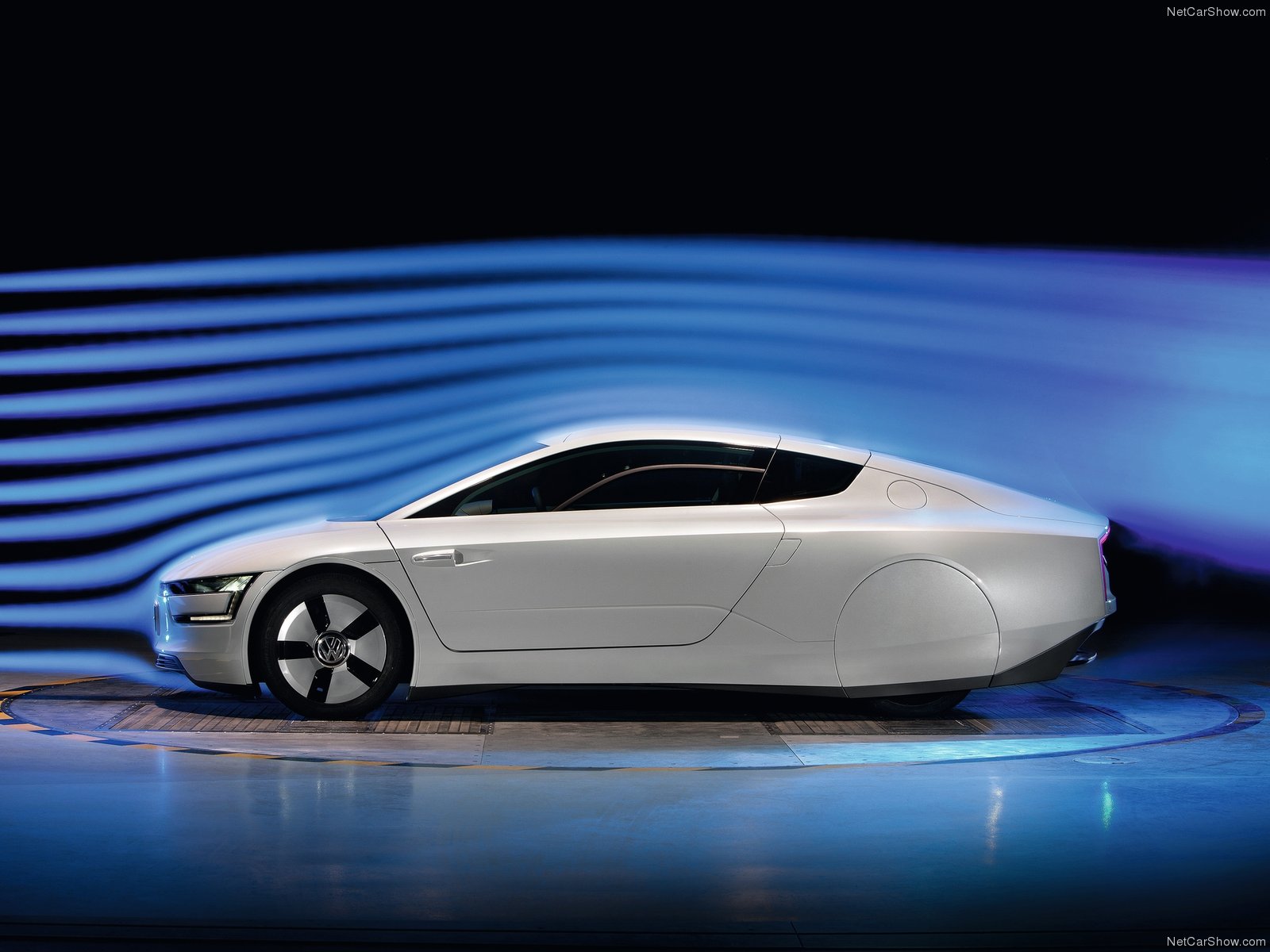
When air hits an object, it has to move around said object. The larger an object is and the faster it is moving, the more air pushes back. When air is pushed around an object in an inefficient way, it creates a disorderly pocket behind the object where air swirls around in no particular direction. The force of the air moving around is called “drag.” Teardrops are the most aerodynamic shape because their tapered shape barely moves the air, creating little to no drag.

Look, I like baseball, alright?
Spending time with that tool should demonstrate how flowing shapes are more aerodynamic and create less drag than blocky, angular ones. That element of satisfaction is one of the biggest reasons why we prefer supercar designs to most others. While there are exceptions, we generally don’t think of the Chevrolet Suburban or Nissan Cube as “beautiful.”
But what if I told you[images2.minutemediacdn.com] drag can be a good thing, too? What if I told you the greatest performance vehicles in the world intentionally create drag? Ladies and gentlemen, please welcome downforce to the stage.
When air flows over an object at high enough speeds, it can be redirected to push downwards on the object. That downward force is called, well, downforce, and it’s the reason why sports cars can go around corners quickly. However, while downforce is the key to good handling, it lowers top speed and hurts fuel economy.
Formula One cars are super slippery, right? The bodies are, yes. But thanks to their incredible plethora of spoilers and vents, Formula One cars can generate twice as much drag as a Hummer H2. Those massive tires need tons of grip to properly apply the engine’s power to the road, so the cars are designed to maximize downforce over aerodynamic efficiency. That’s why they can produce over 1,000 horsepower but only reach 211 mph.

Whether you’re creating a hypercar or a grocery-getter, aerodynamics follow the same principle as other design features: don’t use what you don’t need. If your vehicle isn’t rear-wheel drive, don’t add a rear spoiler. Delivery vans don’t need tons of vents. Active aero might be a nice touch in a luxury sedan, but don’t sacrifice ride quality for some extra fuel economy. Think of aerodynamics like lightning in a bottle; it can do great things when harnessed properly, but handling without care can cause a world of trouble.
Part Nine: Evolution
When it comes time to create the next generation of a car, the same argument springs up in every design department. “Do we establish a clear connection to the old model, merely modernizing the existing design? Or do we start fresh with a clean slate, a tabula rasa, and give the market what it demands?” This is the argument between evolution and revolution. Unlike evolution via natural selection, there’s no definitive answer. In fact, there is a place for both viewpoints.


The Toyota Corolla is a great example. Not a single styling cue was preserved for its 2014 redesign. Out went the inoffensive mid-2000’s all-in-one printer styling, and in came a chunkier, edgier, more aggressive look. It was something of a bold choice at the time, but considering the Corolla is the best-selling car in history, it paid off.
Higher-end brands tend to favor evolution. Luxury manufacturers aren’t selling transportation or trends – they’re selling the brand itself. “90 percent of the people who walk in here,” a good friend of mine and former Lamborghini salesperson once told me, “already know what they’re going to buy.” Lamborghini buyers aren’t swayed by the interior features or gas mileage compared to a Ferrari; they sign on the dotted line because they want a freakin’ Lamborghini. As a result, upscale marques seek to evoke their reputation by connecting each model to their history. They want to remind you why you think of their brand in the first place.

You’re probably getting tired of hearing this, but there are exceptions to the rule. Big surprise. Evolution tends to be favored by companies with strong sales, while revolution is usually employed by manufacturers who aren’t moving hardware. The VW Golf, for instance, has evolved extremely slowly over the years because its buyers have shown they don’t want much to change. Meanwhile, when a stagnant Jaguar was floundering in 2008, they threw tradition by the wayside and basically started from scratch. It’s really a matter of throwing things against the wall and seeing what sticks.
Part Ten: Timelessness
No designer wants to see their latest model, hot off the presses, quickly become yesterday’s news. Not every company has the budget to release a new generation every five years, either. But if you do your job right, you don’t have to start prepping a replacement as soon as its predecessor rolls off the production line. I mean, the Maserati GranTurismo stuck around virtually unchanged for 13 years! Its production spanned two global financial crises!
It’s tough to say what makes a car age like a fine wine; design is, of course, an un-scientific field. Instead of looking at the classics, let’s think about some models from 10-15 years ago and see why they still hold up. I have three theories as to why some designs age gracefully.


“When people ask me what is the problem with cars of the future, I say it is the mental barriers in the heads of designers. It is not the management’s fault or the customer’s fault or technology’s fault, it is these things in our heads. We’ve got to end the banality. We’ve got to get rid of the normal.”
Bangle embraced the revolutionary spirit[europe.autonews.com] by asking one question: “What do we have the technology to do right now?” It takes time for the masses to adopt cutting-edge technology, whether it be television, mobile phones, or BMW’s iDrive (a watershed feature our early-2000’s minds were too smooth-brained to understand). If you force the public to adopt something they haven’t warmed up to yet, you will undoubtedly be divisive. However, once everyone else catches up with you and your innovation becomes seen as standard, you will be vindicated by the passage of time.
Theory #3: There is a pattern to evolving design trends. They say those who fail to learn history are doomed to repeat it; in this case, we’re learning history in hopes of repeating it. Excuse the upcoming use of grossly exaggerated blanket statements, but post-war automotive design has followed a 10-year cycle of shifting tastes. The market ping-pongs between shapes which are angular, rounded, simple, and complex, reacting to changes with varying degrees of severity. Here’s a chart to help you process this theory and predict the future.
I’m not a fortune teller. I can’t tell you which way design trends will move next. By reading this far, though, you probably want me to take a guess.

It’s up to you, though, to guess where the future will take us. If your guess pays off, not only will your designs be future-proofed, but you’ll earn the right to call yourself an innovator.
Conclusion, Part Two
Ten chapters are now in the books. I started writing this guide because I’d never put these thoughts down on paper, and since automotive design is no longer my career path, I figured it might help somebody else. It’s since evolved into a nearly 7,000-word design treatise, a true automotive magnum opus. And seriously, from the bottom of my heart, I’m truly grateful for the response I’ve received from a bunch of Internet strangers.
This became the most popular guide for Automation of 2020, with nearly four times as many views as the silver medalist. It’s now the second highest-rated Automation guide of all-time. It hit 200 favorites on the day of its completion (1/17/21) and has 66 Steam awards at the time of writing. Now that I can take a deep breath and bask in my own achievement, I’m inevitably led to ask one question.
I hope not. It’s fun to play Aristotle to all you young Alexander the Greats out there (though many of you are probably older than me), but it’s a very time-consuming endeavor. I don’t plan on adding any more formal chapters. However, I hope to add some form of new content eventually.
I imagine it’ll take the form of the occasional bonus section, like the one on muscle car styling I previously wrote. I have a couple ideas floating around in my head. I’ll hang around the comments and answer the occasional question. And maybe, just maybe, I’ll write a guide to taking better screenshots in Photo Mode. Please let me know if you’d find that helpful.
If you have specific questions, or you’d like me to critique one of your designs, drop a comment below. Check back every once in a while and see if I’ve added anything. Now that you’re armed with all this knowledge, go out there and do something great with it.
Bonus Section: Muscle Car Styling
Someone left a comment asking about the finer points of designing a 1960’s muscle car. My response was too long to fit in a comment, so I created a new section out of it.
In order to design muscle cars (especially their headlights), you have to understand the design’s historical context. Modern muscle cars mostly stem from classic designs, so it’s applicable to new models, too.

Americans are extremely confident in the 1950’s, and this also reflects in the automotive industry. They’re still riding that “beat the Nazis” high, the Eisenhower economy is booming, and the “American Dream” is formalized as a mortgage, two kids, and a two-car garage. Styling means ostentatious excess: tailfins, chrome, whitewalls, and so on.
Then the Soviets launch Sputnik in 1957, the economy goes under a year later, and the first man in space is a Russian. It’s like a cocky boxer getting socked in the mouth in the first round; goodbye arrogance, hello conservative stance. American confidence and car styling are swiftly humbled. Look at how the Ford Thunderbird transforms between 1960 and 1961 – it’s night and day.


Meanwhile, fighter jets are now supersonic. They have the aerodynamics more or less figured out, and now they’re quite pretty. Legendary industrial designer Raymond Loewy specifically takes note of the Northrop F-5. Its aerodynamic shape, he realizes, has a passing resemblance to a Coca-Cola bottle laid on its side…
Bam! Loewy pens the 1962 Studebaker Avanti, introducing Coke bottle styling and changing car design for the next ten years. Bill Mitchell of General Motors takes notice, and 1963 brings the Buick Riviera and the Corvette Stingray. The next year, John DeLorean decides to throw Pontiac’s biggest V8 into the tiny Tempest, and the rest is history.

Without pontoon fenders to separate the lights from the grille (like cars of the 30’s and 40’s), a majority of designers integrated headlights into the grille. The Buick Riviera also popularized pop-up headlights; American safety regulations didn’t allow them to emerge from the hood, like European sports cars, so they were hidden in the grille instead. It became fashionable to create the illusion of a big, rectangular block of cooling power.
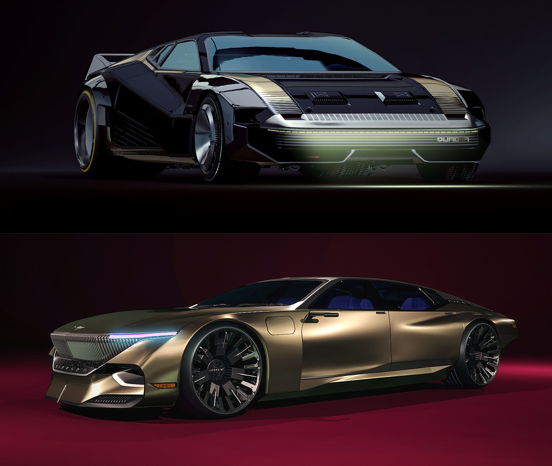
Bonus Section: Cyberpunk 2077
I mentioned the cars of Cyberpunk 2077 in the “Timelessness” section, and I can’t lie, they’re definitely part of why I bought the game. These designs, like shrimp from the best aqua-farm in Night City, are fresh. The team of vehicle designers led by Paweł Breshke Czyżewski[www.artstation.com] did a fantastic job at creating dozens of striking cars both pleasing to the contemporary eye and believably futuristic. It’s a case study encapsulating all the previous sections as well as providing some new insights. So what makes the vehicles of Cyberpunk 2077 stand out?

First of all, it’s important to understand the roots of the cyberpunk genre to see how it’s inherently expressed in these designs. Cyberpunk developed from the late 60’s to the early 80’s, spurred on, I would argue, by four pioneering works of different mediums: the novel Do Androids Dream of Electric Sheep, the comic Judge Dredd, the music of Kraftwerk, and the film Blade Runner. All four works, at their core, are critiques of capitalism. It’s not about the futuristic technology – it’s how the technology is abused by corporations so they can get you to buy things.
Of course, technological features are the name of the game here. The cars of the Cyberverse have thin LED headlights & taillights, digital license plates, cameras in place of mirrors, and roof-mounted lidar systems for autonomous driving. All these gizmos must require tons of cooling to prevent overheating, no doubt contributing to the styling excess. They also must be prominently highlighted within the design because the product is also the marketing. If you’re in the market for a car with self-driving capability and someone drives past with a massive lidar box on their roof, well, whoever bought that vehicle is paying you to do your marketing for you.
But while all of this explains why Cyberpunk 2077’s vehicles have certain features, it doesn’t explain why most of them look fairly stunning. It all comes down to one word: depth.