Overview
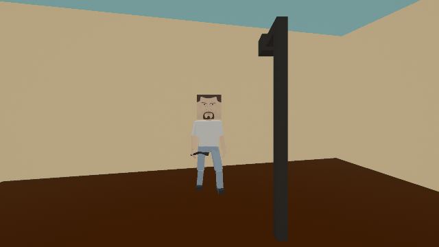
There is a lot of levels on the workshop. But 70% of them are complete trash that no one will ever subscribe to.Here I will tell you about making these 30% that YOUR creations must be amongst!P.S. The image in the title is an example of a bad level.
Basics
Starting off, your level is valued by the following criteria:
1) Size
2) Difficulty
3) Creativity
4) Ambience
5) Optimization
All of those aren’t hard to balance.
— if you want to create a smaller level, you should provide enemies and the player with opportunity to move around, so try enabling navmesh to see if anyone can walk between a tight place. If you are planning on making a huge level, be sure to avoid leaving it empty, that is, you need to use more props/enemies or try to build something fulfilling, like a statue.
— that’s an easy one. Just look at the time it takes to beat your level — it needs to be no more than 10 minutes, otherwise the players will get bored. If you make levels shorter than 2-3 minutes, just forget about the Editor. Also, you should never modify the damage multiplier higher than 1.2, as any greater value often leads to one-hit-kill.
— make something unique. Don’t just put people in random rooms, your level should have an atmosphere/surrounding/theme, which we’ll talk about below.
— if all the other criteria are met, this is the conclusive thing. Where does your story take place? Typical themes are: a bar, a factory, a market, a town, a bus/train/plain/pain/paint. If you have a better idea, go ahead and realise it.
— biggest issue when making a big and creative levels.
First: never put more than 60 people in a level.
Second: avoid using any lights, as they basically drain FPS.
Third: don’t use many platforms.
There are some examples of elaborate, but optimized levels:
1) Stay in Shadow: the level has many props and huge rooms, but not many people in it.
2) Chicago roof walkers: the level comprises many enemies, but they’re divided into zones, which
makes it smoother than it should be.
3) Fall of Rome: this is a genuine design, the level maintains many people, platforms, and even huge amounts of fire, but it runs quite smoothly for its size. It’s because, again, the enemies are divided, and the author avoided using many props.
4) Pain to Town Battleground: there are 125 people, but because of a lack of weapons it gives 40 FPS even on a cheap laptop like mine.
Promotion
People also tend to look at these factors, when they are choosing an item to subscribe to:
– Name
– Title image
– Screenshots.
Avoid using CAPS and mistakes, as this scares all the potential visitors.
Try picking a name that tell about your level in 2-3 words:
Biker bar brawl
Plane simulator
House invasion
Escape the mafia.
When you press F8 it automatically gets rid of HUD, but the arms remain in place. So hold a demonstrative or small weapon when capturing your future brand title.
If your map comprises several rooms, capture everyone of them from an angle that allows to see the whole place from the best point of view.

