Overview
Purity-schmurity, color correction will always improve images and videos! This guide will teach you how to use Source Filmmaker’s inhouse color correction tool for your projects!
Forewords
This is a guide I have spent weeks working on, with moderate research, rereading the guide for spelling errours, typos, grammra errors, providing screenshots, cropping them down, and generally perfecting this guide for a filmmaker (you) with little to no prior experience with color correction (maybe you).
I am not an expert on color correction, but that shouldn’t stop me from making an in-depth guide of color correction for novices. Source’s color correction tool maybe not be the sharpest knife in the place where you put knifes, but it does get the job done.
This guide wouldn’t make you a master of post-production, but you get to know how to use the tools used for color correction work without going into ridiculous depths. If you want to know more about color correction, please ask Mr. Google about that.
Also I use custom models for my screenshots, all of them can be found on [link] (you’ll need Garry’s Mod for this).
Thank you for your time, I hope you will find this tutorial useful when you’re working on your project, if you feel generous enough to credit me in your project, feel free to do so.
Yours, Christoffer395.
Introduction to Color Correction
What is color correction?
Color collection is a form of collection where the collector gathers several colors from…
I said color CORRECTION, stupid!
Oh. Color correction is about altering the overall color and volume (light) of a scene, whether it’s a poster or a movie.
What is color correction used for?
Color correction is used to manipulate existing colors and volumes to either set a theme, reflect feelings of the main character, adjust overbearing colors or volumes, and stuff like that.
Why do we need color correction?
Because your project looks boring without it, think color correction as a form of seasoning or sauce for your steak.
Why can’t I just use lights instead of color correction?
Because there are certain important things color correction can do that lights can’t, I’ll explain later.
Can’t I just use Photoshop or Premiere for color correction?
If you already have either of those tools, you wouldn’t need this guide then. But this guide is for those who doesn’t have the necessary program to do so. Plus this guide also includes information about filters you can also use in Photoshop to an extent.
Now I didn’t start this guide to teach you about color correction (actually I do, little joke), so… *ahem* Let’sa Go!
Okee-Dokee!
Step 1: Get the console working
What is this “console”?
It’s an ingame tool used by the developers to poke around with the game, finding bugs, exploits, or just to mess around with it.
Why do I need it?
The console has this color correction feature. With that you can create your own color correction files, and use them for Source Filmmaker.
Alright, how do I get the console open?
Here are the steps.
Step 1/1
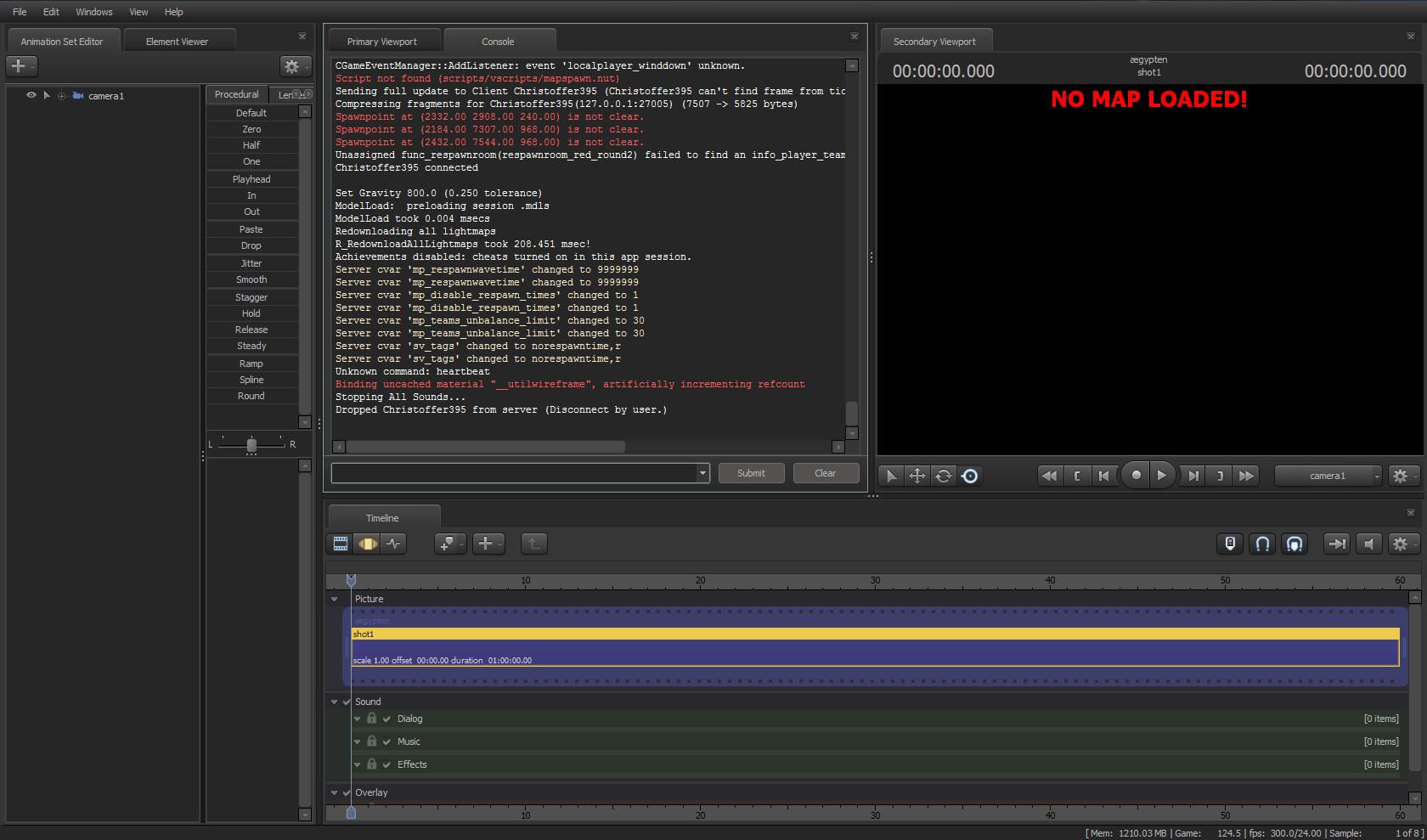
Click on the Windows tab, and select “Console”.
It should now look like something like this:
It’s that easy, now let’s get that color correction feature up and running!
Step 2: Bring up the Color Correction Feature
So, how do I bring up this color correction doodad up?
Load a map and type “colorcorrectionui” in the console.
Okay, now what?
Hit F11, you’ll know what happened.
Holy *fecal matter*, what’s THAT?
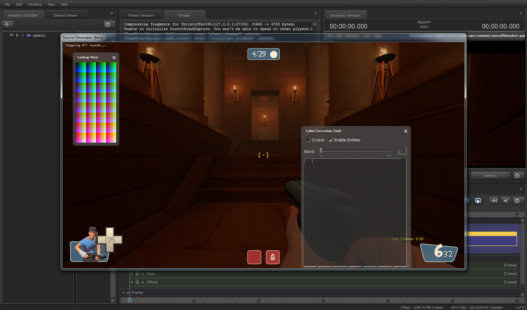
It’s the color correction UI.
Oh, okay how do I make color correction?
I’ll show you in the next section.
Overview of the Color Correction UI
OMG IT’S CONFUSING, HELP
That’s why I created this guide, this section is to show how to use the Color Correction UI. I even throw in a bunch of screenshots so it’s easier to understand.
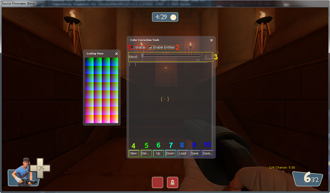
This is how the Color Correction UI looks like. To the left you have the Lookup View, a fancy panel full of colors. It has no practical use, so either leave it be or close it.
To the right you have the real deal, the Color Correction Tools. There are buttons, checkboxes and even a slider, professional stuff right there. Now I’ll explain what these buttons, checkboxes and also what that slider does, just so you wouldn’t burn your butt from trying it out yourself.
1. Toggles your color correction on/off.
2. Don’t know, looks fancy though.
3. Sets opacity for selected color correction layer, the lower the number is the less effect your color correction has.
4. Creates new color correction layer.
5. Deletes selected layer.
6. Moves selected layer higher up on the list (used for sorting).
7. Moves selected layer lower on the list.
8. Loads color correction file for editing or testing out.
9. Saves current changes. DON’T use this on new files.
10. Saves current changes into a new file.
Now let’s get to the creative part of color correction.
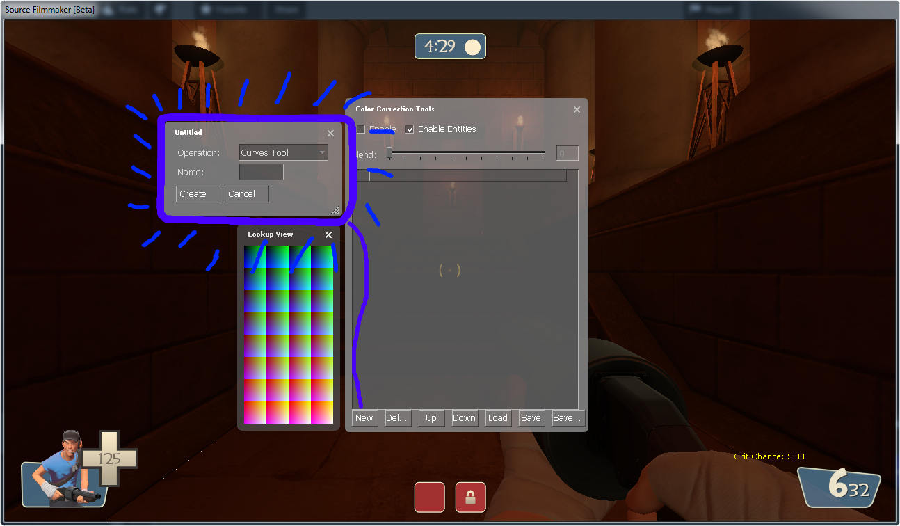
Click on the “New” button and this will appear:
Here you have “Operation” and “Name”. Operation is what kind of layer you want, there are Curves Tool, Levels Tool, Selective HSV Tool, Lookup Tool, and Color Balance Tool. Name is used to give your layer a name so you can more easily look them up.
If you have worked with graphics software like Photoshop, you’ll recognize most of them, this guide will cover up those who doesn’t. If you already know how to work with these tools, then you are free to make your adjustments, just be sure to follow up on step 3.
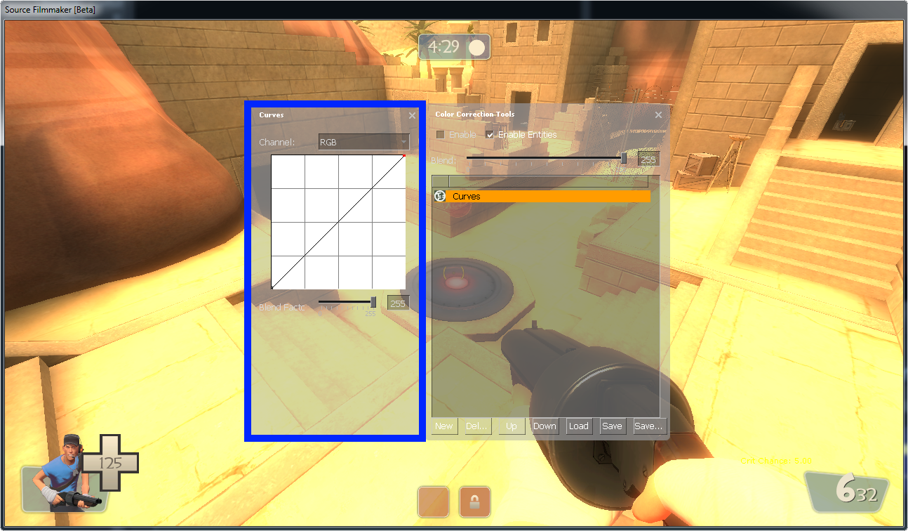
Let’s start with the Curves Tool, so select Curves Tool and press OK. Now in these next 5 sections I will tell you how to use each of the five tools.
Curves Tool
The Curves Tool[www.adobe.com] allows you to strengthen tones and constrast. Here you have a line which you can drag, creating curves.
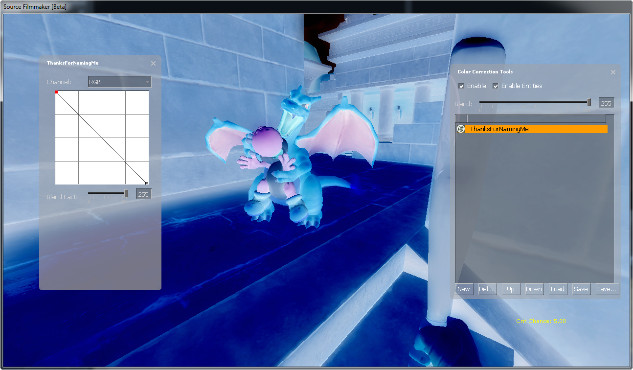
Before we try using it, here is a bunch of examples:

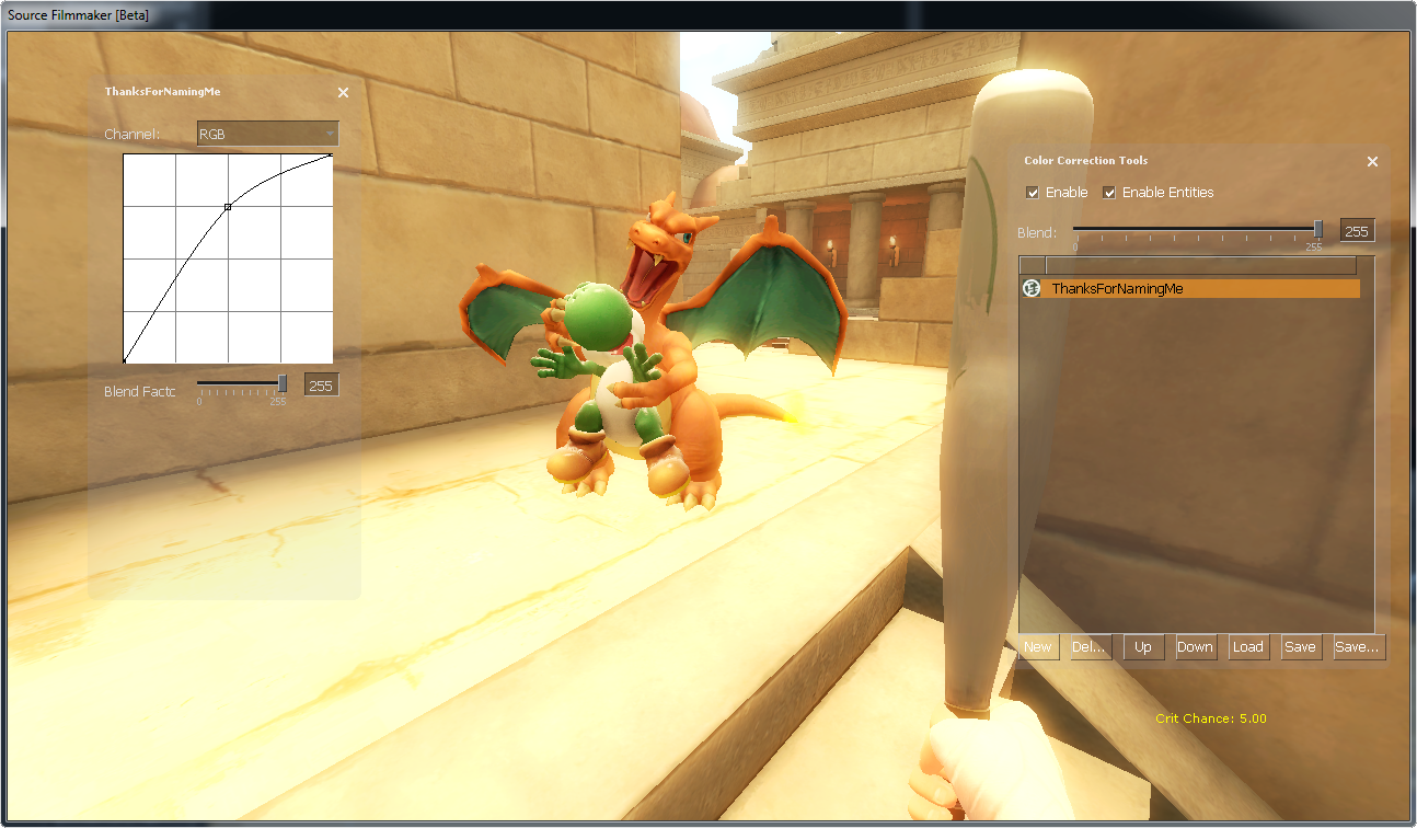
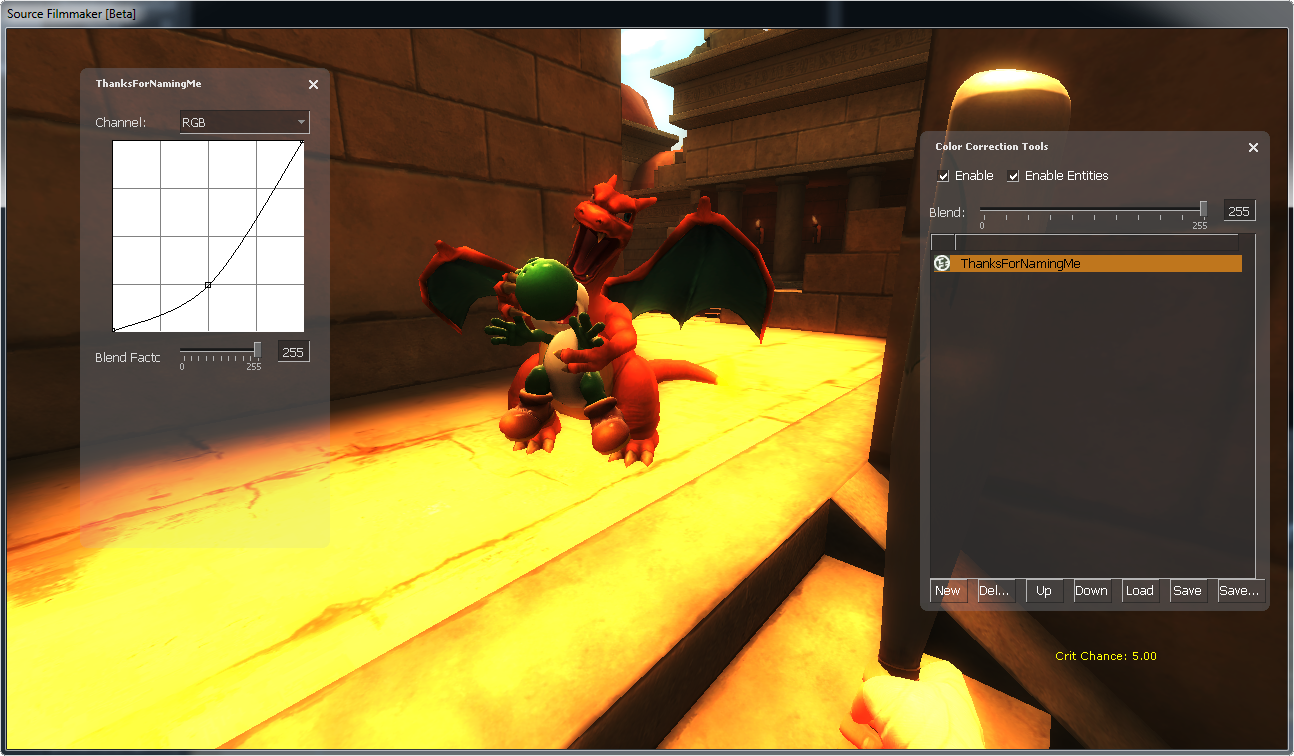
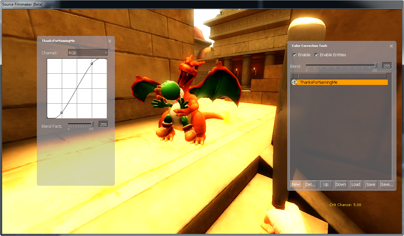

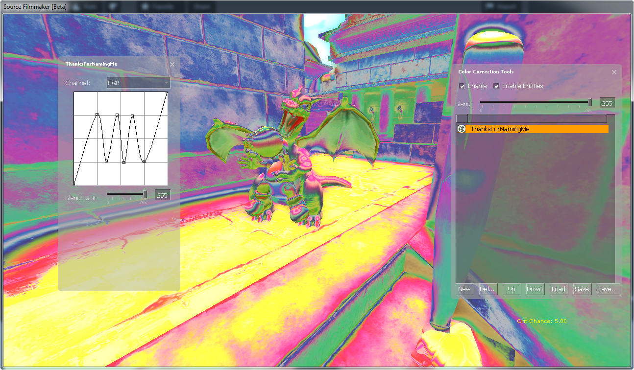
For those of you who don’t understand the charts, let me break it down to you: Left and up makes things bright, right and down makes things dark! If that doesn’t help, maybe you should just try messing around with it until it makes sense.
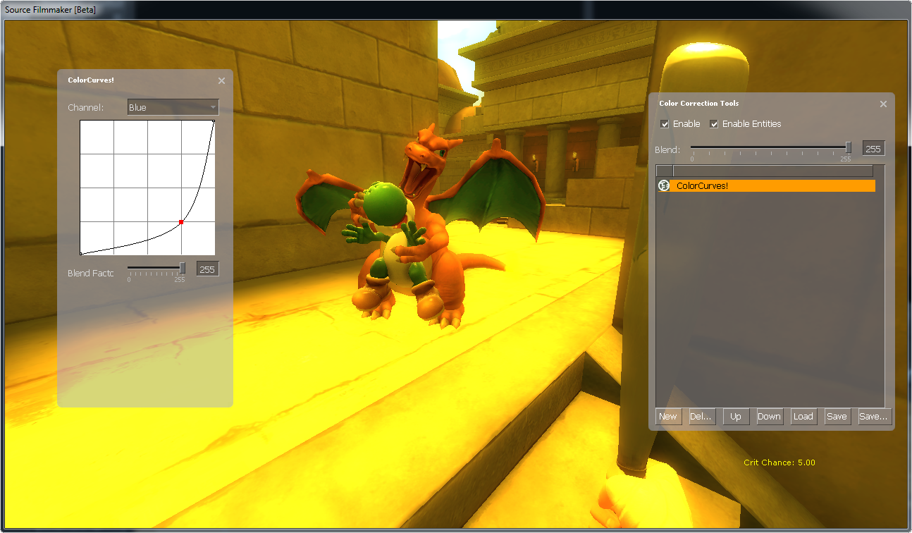
Curves tool isn’t restricted to brightness, here is some other examples where I increase/decrease the tones of each colors.
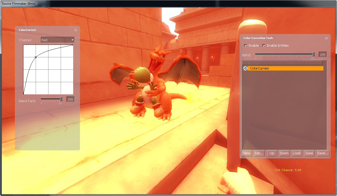
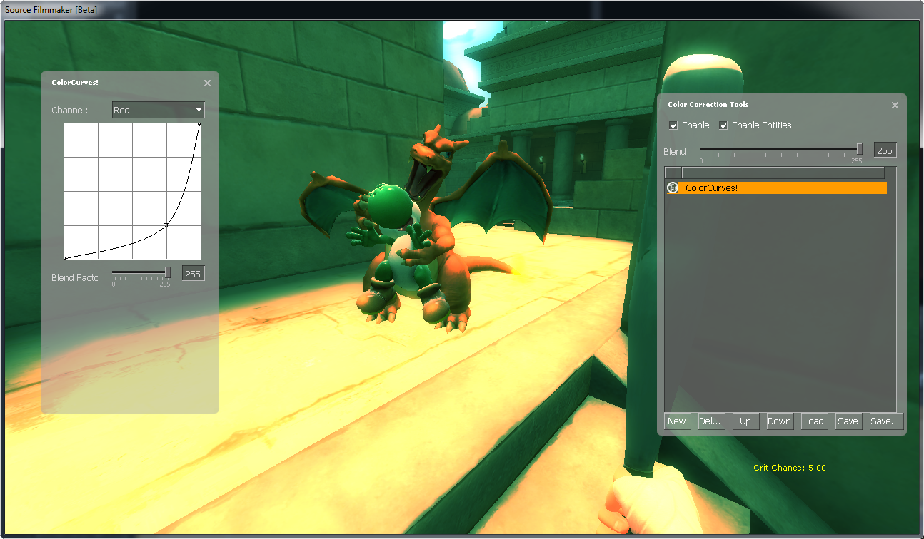
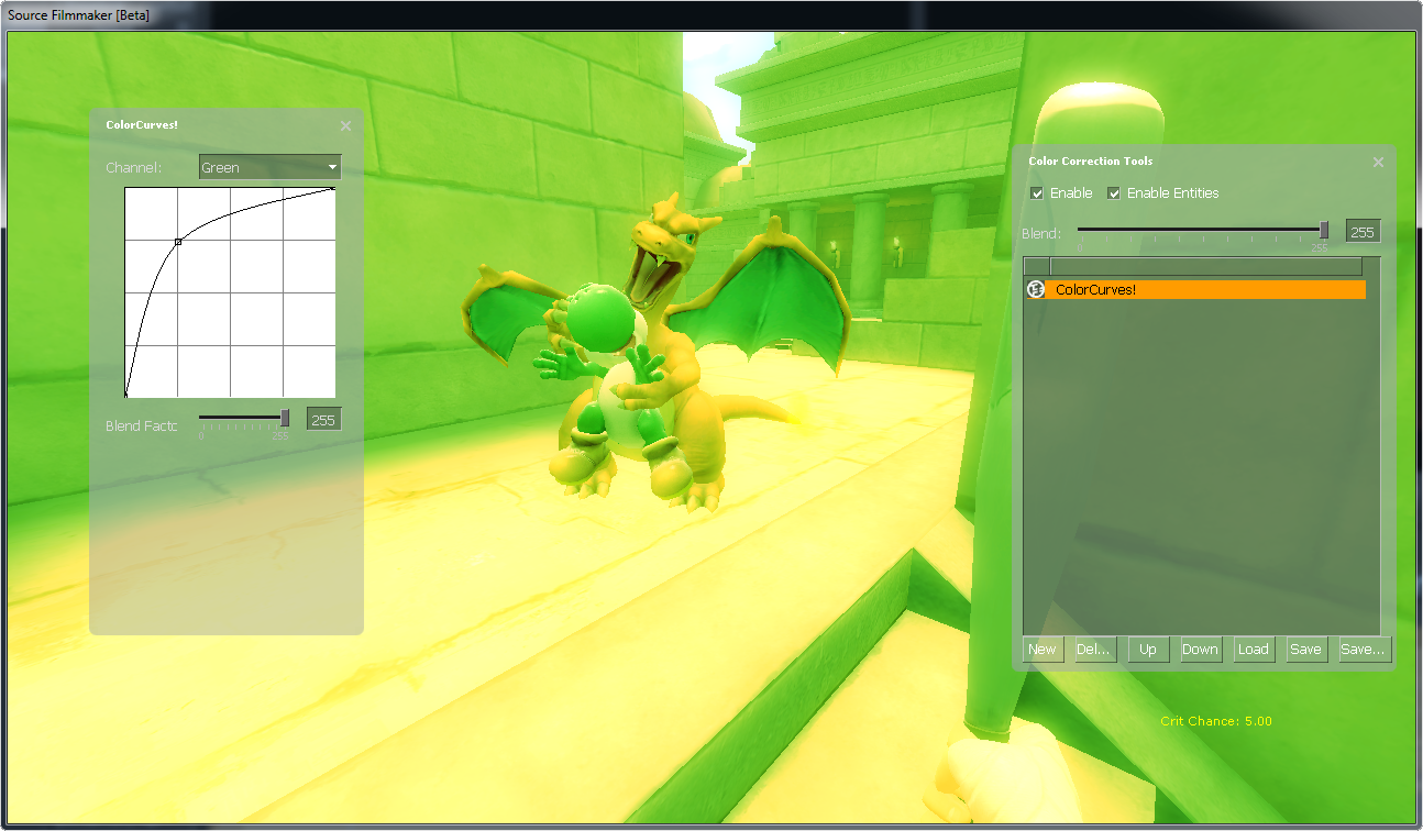
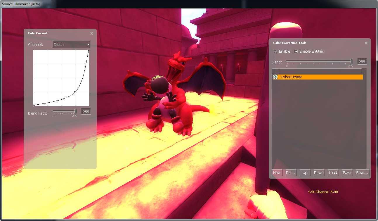

Now you (probably) know how those curves work, so let’s do it ourselves: Hover your mouse over the line, hold down your left mouse button, drag the line somewhere, like up or down, release left mouse button. Well done, your first curve.
Below the curve you have the “Blend Factor”, which sets the opacity of your current layer. I’ll show you an example later, just hold tight.
Experiment with it all you want, or maybe search around the internet for some tricks.
Levels Tool
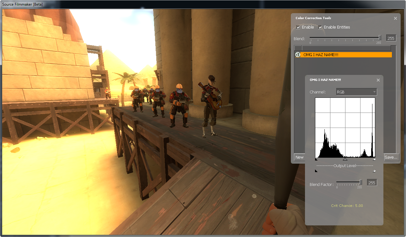
The Levels Tool[www.cambridgeincolour.com] is the Curves Tool’s little brother, it is also used to adjust tones and constrast, but in a different way than Curves Tool.
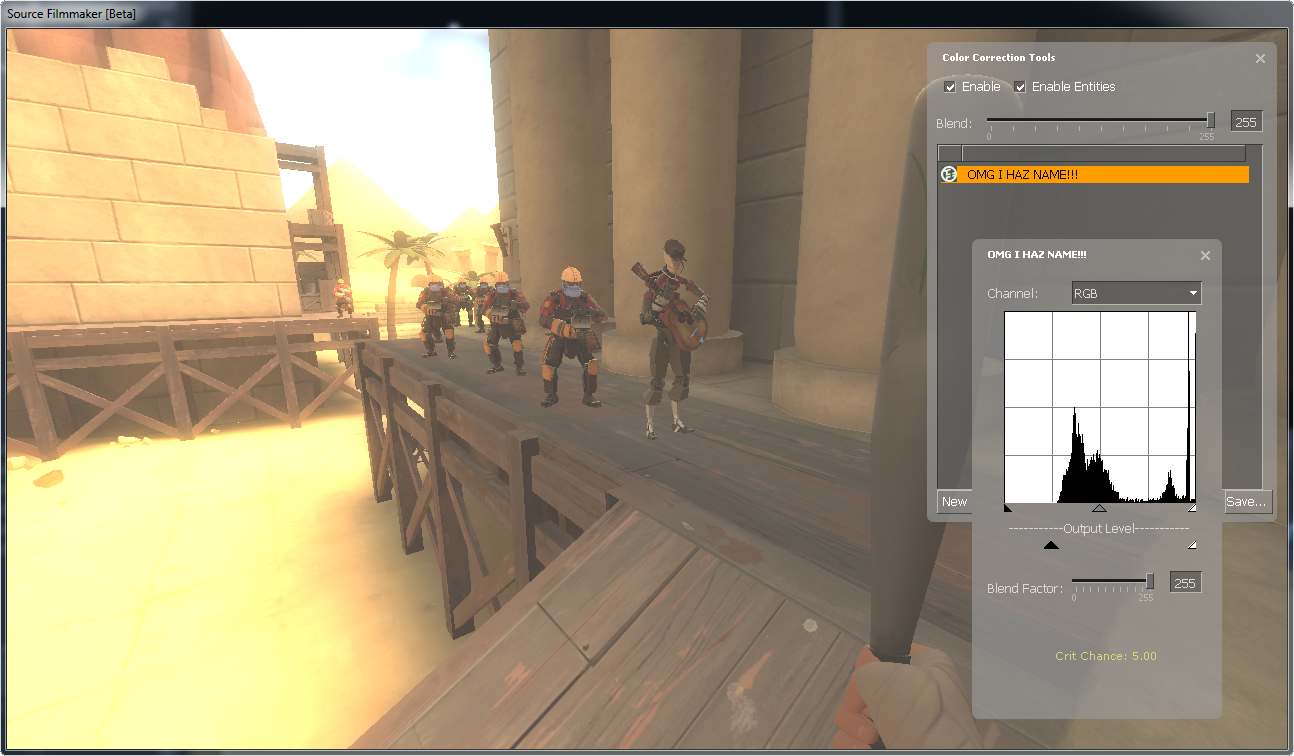
Before we begin, here is a few examples of how images looks like before and after they have been treated by the Levels Tool.

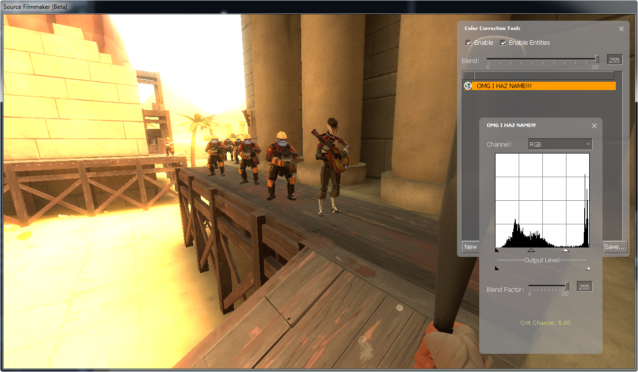

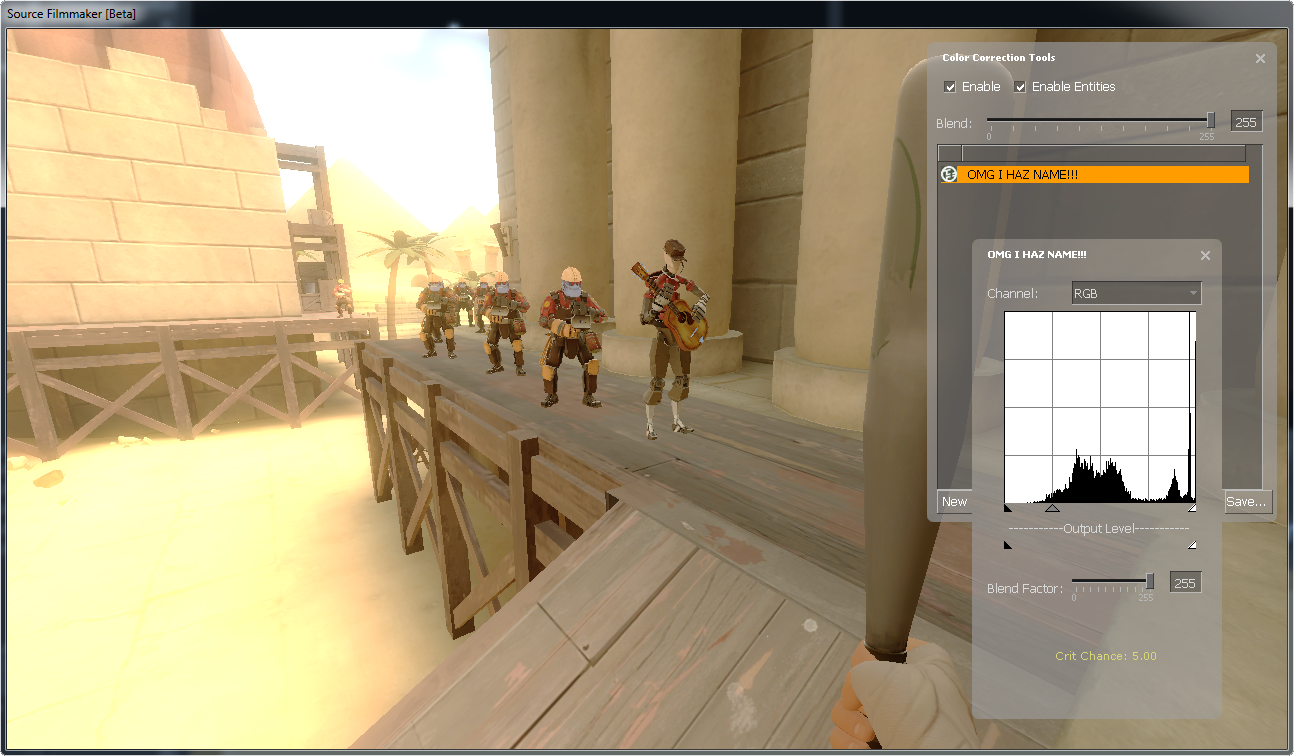
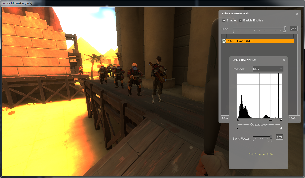
Levels Tool works like this in layman’s terms:
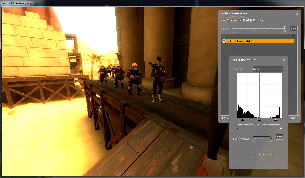
- White slider to the left makes things brighter!
- Black slider to the right make things darker!
- Gray slider to the left makes things overall brighter!
- Gray slider to the right makes things overall darker!
- White slider to the left AND black slider to the right makes things more “constrasty”!
Below there is the “Output Levels”, which defines the maximum brightness and darkness of the image. Here is some examples:

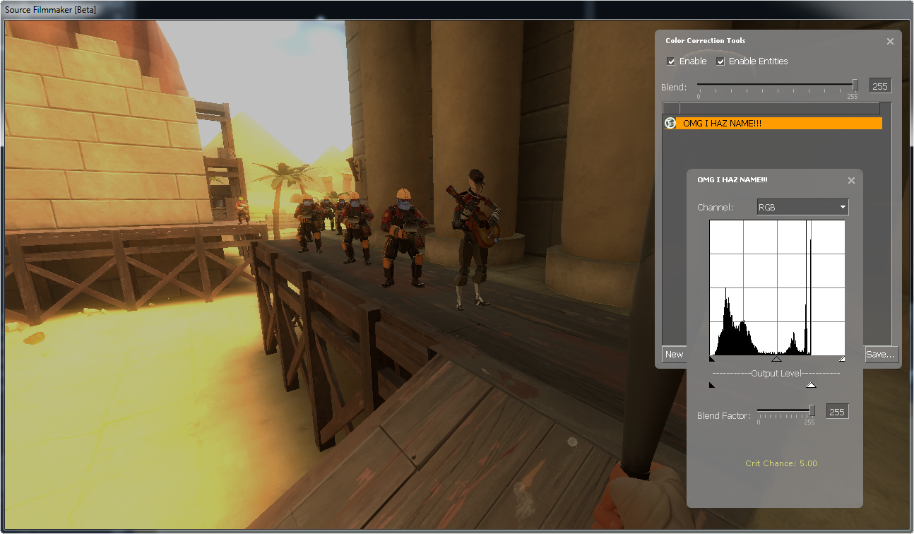
If you notice, you’ll see that the areas where it normally should be either blindingly bright or pitch black has been dulled out, turned gray. So in layman’s terms: white slider makes bright things gray, black slider makes dark things gray.
Just like the Curves Tool, this tool also works with different colors, but I probably don’t have to show more images for that. Remember that it is easy to butcher up your color correction with this tool, so use the Levels Tool with precaution.
Selective HSV Tool
This is the Selective HSV Tool, one of the tools to handle colors. Here you get an impressive amount of sliders, and I am about to explain what each of those does. Before we begin however, you’ll notice the “Select Nearby RGB”, change that to “Select All”.
Colorize and Invert Selection
I will mention them later, you’ll want to know the other settings before you’re going to use either of these checkboxes.
Hue
Hue changes colors based on degrees. Hue uses the “color wheel[upload.wikimedia.org]” to define colors. Now for an example:
This is the original image with lots of colors. Before we begin, take note of the colors of various objects, like the red Heavy, orange Charizard, yellow Pikachu, green Yoshi, and blue citizen. We are going to mess with their respective colors. Now let’s see what happens if we set hue to 60.
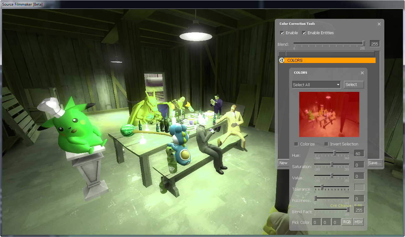
Then the colors changes, red becomes orange, orange becomes yellow and so on. Now set it to 120.
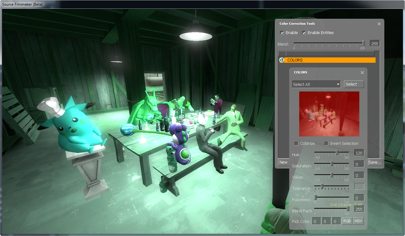
Now they get new colors again, red is green, green is blue, blue is red, yellow is cyan, cyan is magenta, and magenta is yellow. Now let’s bump it to 180.

Obviously every color is now inverted (red is cyan, green is magenta, blue is yellow, and vica versa). Note that brightness and darkness isn’t affected at all, this will make inverted colors more pleasant for the eyes. Now if we set it to 270.
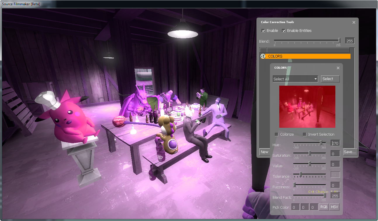
New colors again, but now the color wheel spins the other way (red becomes purple, orange becomes red, etc.). You can experiment with it all you want, but use it carefully since it can seriously mess up your project.
Saturation
Saturation controls how strong the colors are. I’ll explain how they work with images below:
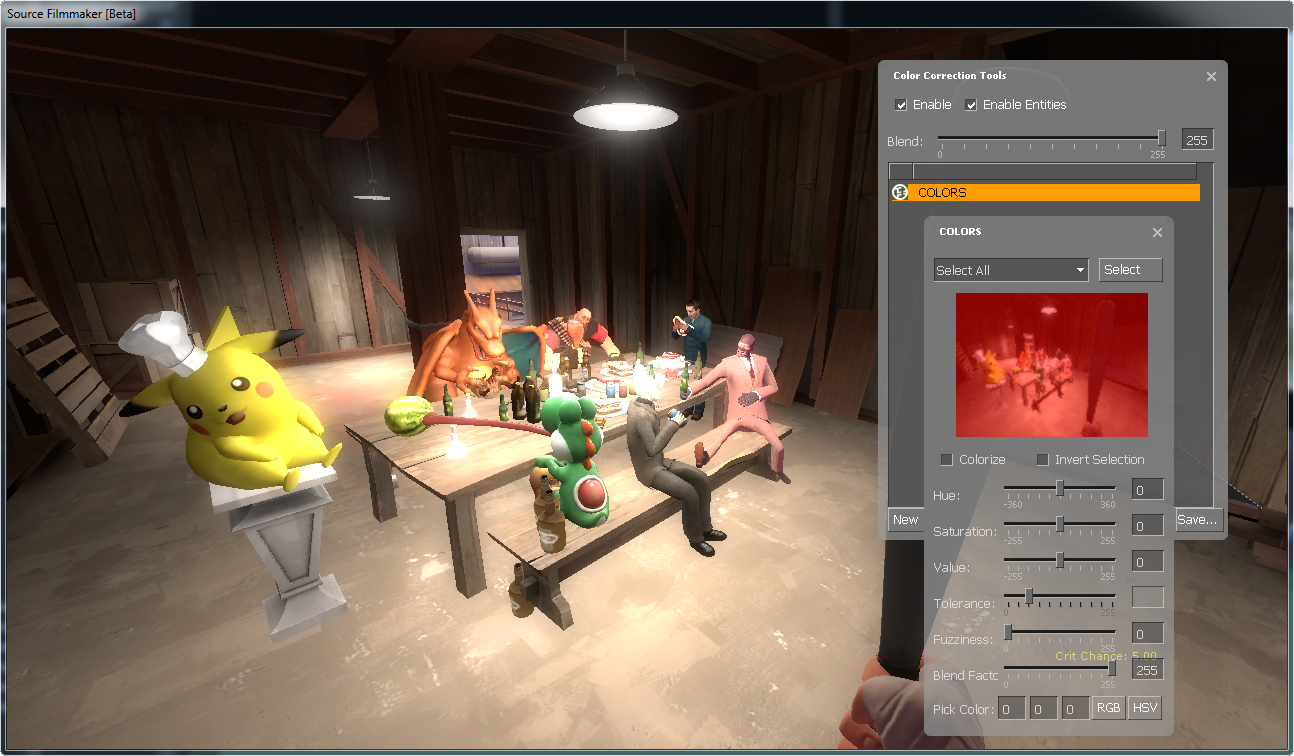
Here is the same original picture, now if we increase saturation…

…the colors comes to life, they become more intense, and the image looks juicier than before. Now if we decrease saturation…
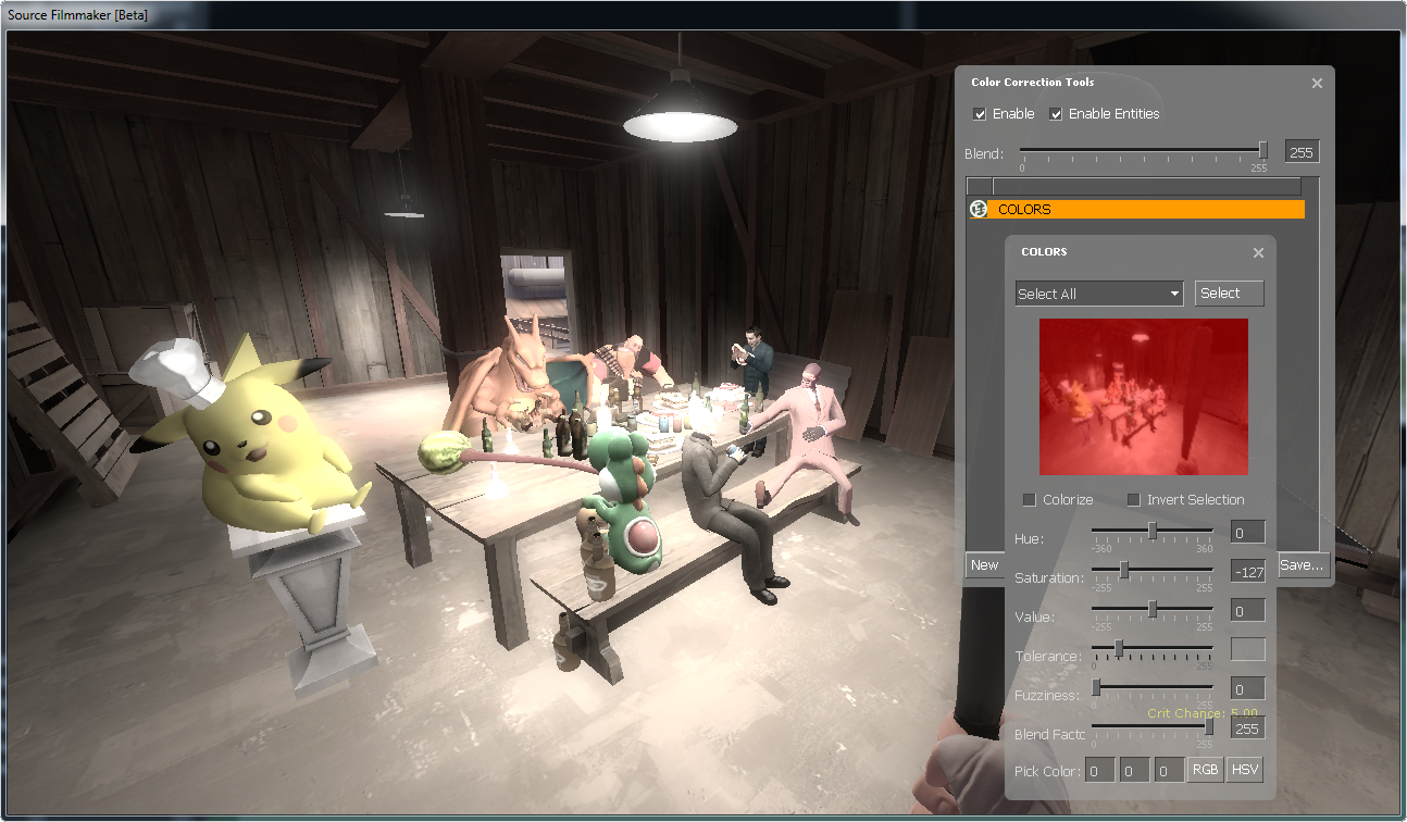
…the colors becomes washed out, they become dull and boring. Finally if we set saturation to -255…
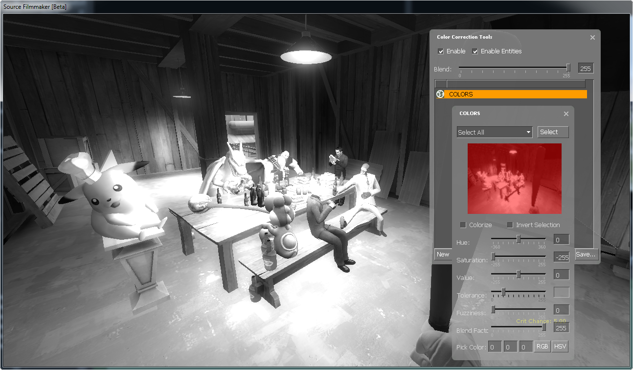
…it becomes black and white, because all colors are now gone.
Value
This is the Curves Tool’s and Levels Tool’s idiot brother, it functions like output levels in the Levels Tool. It is recommended to use either Curves Tool or Levels Tool instead of this one.
Tolerance
Tolerance is only used whenever you use “Select Nearby RGB, Value or Saturation”. In all other cases (like “Select All”), it is grayed out and cannot be used it, so let’s switch from “Select All” to “Select Nearby RGB”.
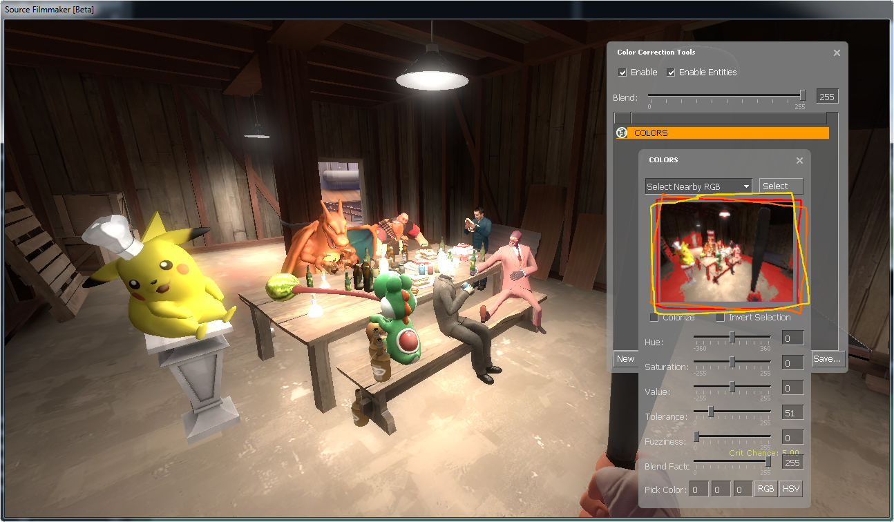
Now you’re going to click somewhere inside the box I totally didn’t paint with tricolored borders. Here I will select the walls by clicking on it inside the borders.
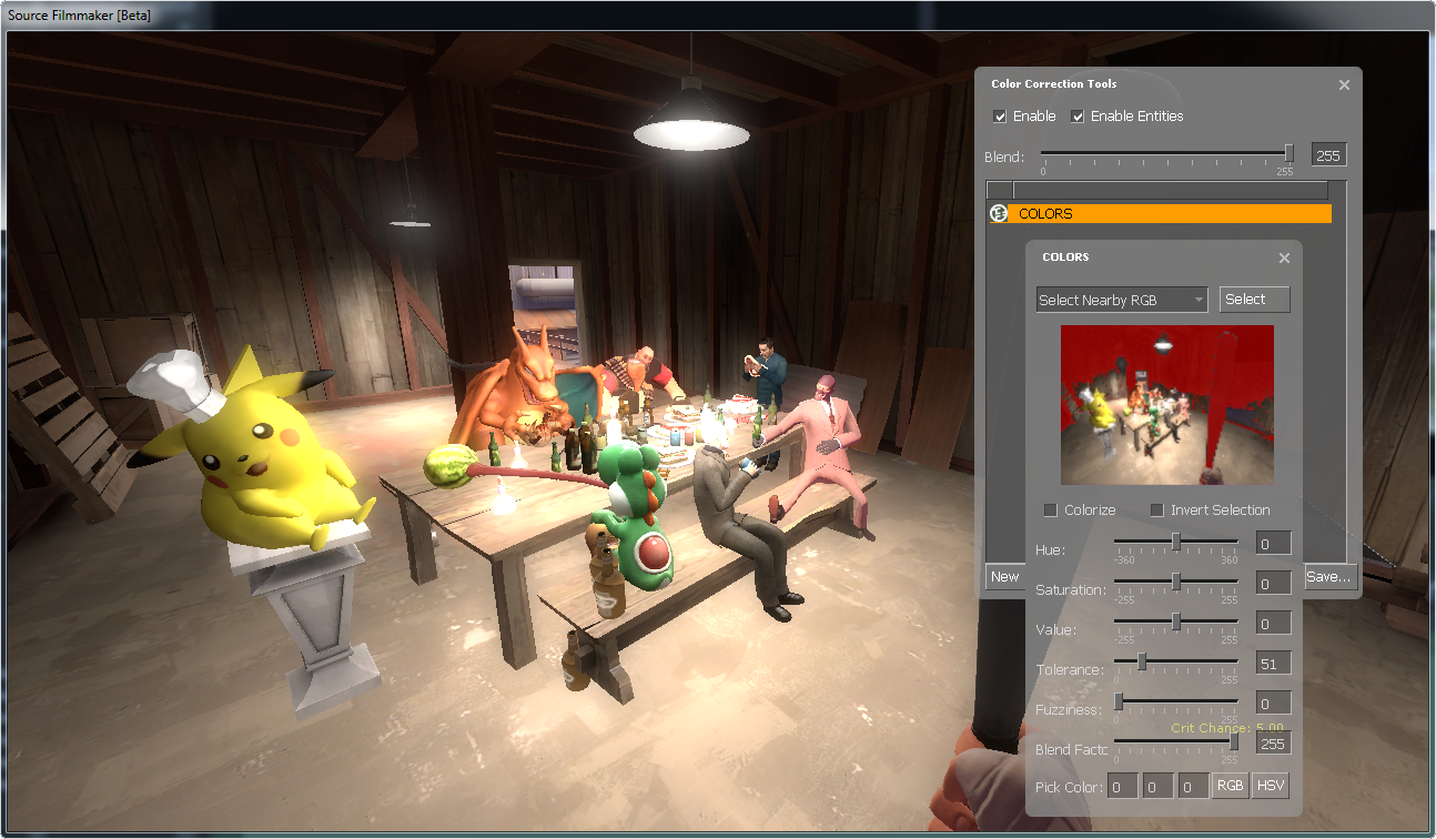
Now the walls inside that little frame is partially red, that means that some of the walls will be affected by any changes in your current layer, try to set saturation to -255 and watch as the walls (roughly) looses it’s color.

Now for the tolerance part, if you need more or less of walls affected by your color correction, adjust tolerance so that the neighbor colors will be affected too. This is mostly precision work, so get ready to frustratingly adjust stuff.
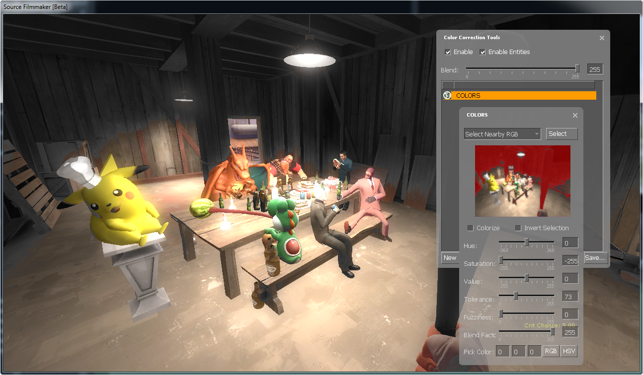
Tolerance will take some time to perfectly adjust or is impossible to get to work perfectly, but regardless what you set it to it will be rather jagged, this can be solved with…
Fuzziness
…this setting! This functions just like feather in most image editing softwares, it will soften the edge of selected colors and unselected colors. Here is an example of a softened selection from above.

See how the edge has been become much less clear, or it has turned into some sort of gradiant selection? Use this tool with Tolerance, this is pretty much essential to get things to look good.
Blend Factor
As mentioned earlier (Curves Tool), this is a little tool that sets the opacity of your layer. If you’ve made heavy changes, you can water them down so you don’t have to readjust all the sliders. Now let’s see this tool in action.

This image is heavily edited and is really nausating with such strong colors, so we make this layer less intense without readjusting any other settings:
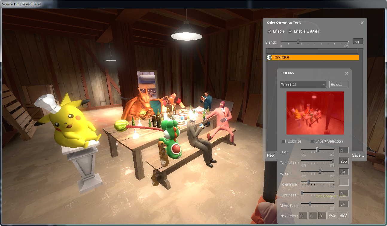
Now the edits has been watered down and becomes more bearable.
As mentioned earlier, we were going to learn about those checkboxes, so here they are:
Colorize
Normally inside the tricolored border from earlier, you saw some parts of the image was red. This doesn’t show up outside the color correction UI, unless you have set “Colorize” on (off by default). Here is an example where I have turned “Colorize” on.
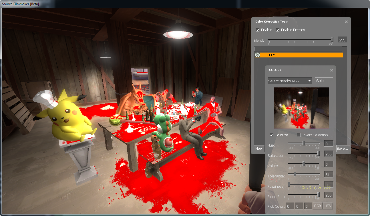
Now I can review what colors are selected on full-screen instead of seeing it on an itty-bitty frame. Note that the colors are affected by saturation, so if saturation is zero or below then the selection will be white, but the higher saturation, the more red your selection will be. Remember to turn “Colorize” off whenever you don’t use it, otherwise it will just look weird.
Invert Selection
At some point you’ll think “But what if I want to choose which colors I want to preserve?”, this checkbox is the answer. As always, images for you.

I want to edit this picture (again) so that only the walls has colors, so I select the walls on this image from the itty-bitty frame (that was previously covered in tricolored borders) like this:
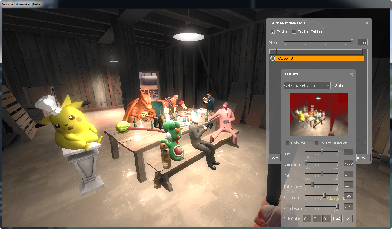
Adjust saturation to -255, now the wall is gray, despite it was the opposite of what we intended. Now if we turn on “Invert Selection”…
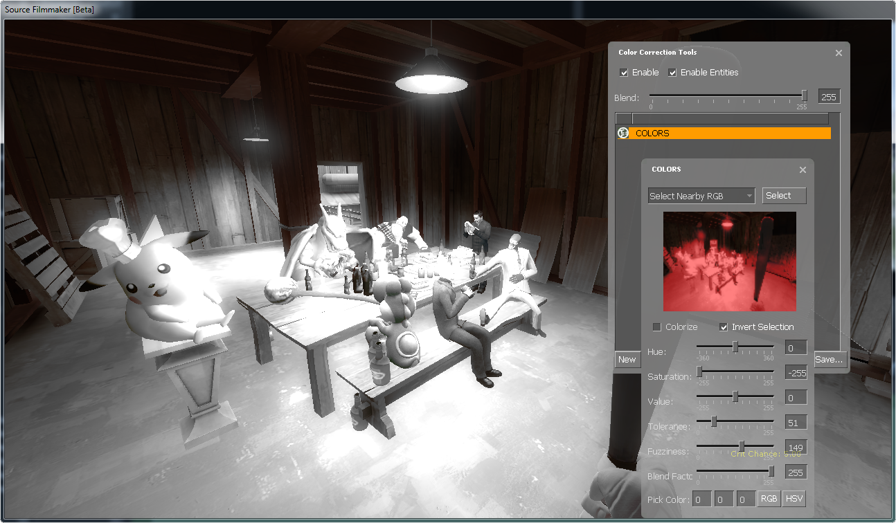
…Everything else than the walls are now black and white!
Pick Color
This little quick setting will select one color, defined either by RGB or HSV colors. This one is rather useless since you can always just select stuff on the itty bitty frame. Let’s skip this one.
Now we are done with this part, so let’s move over to the next tool.
Lookup Tool
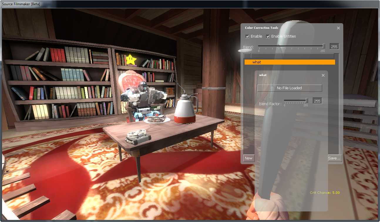
The Lookup Tool is a non-functional tool that possibly should load a color correction file as one single layer. Skip this tool, it isn’t worth telling you how to use it.
Color Balance Tool

Color Balance[www.photoxels.com] is possibly the tool you’ll be thinking about when you hear “color correction”. It’s no wonder why, since this tool allows you to create color bias (like more red than cyan, more green than magenta, and more blue than yellow), providing subtle details to the environment. Now here is some examples:

Here we are in an alphine map in the morning, let’s make this look a little more sunny:
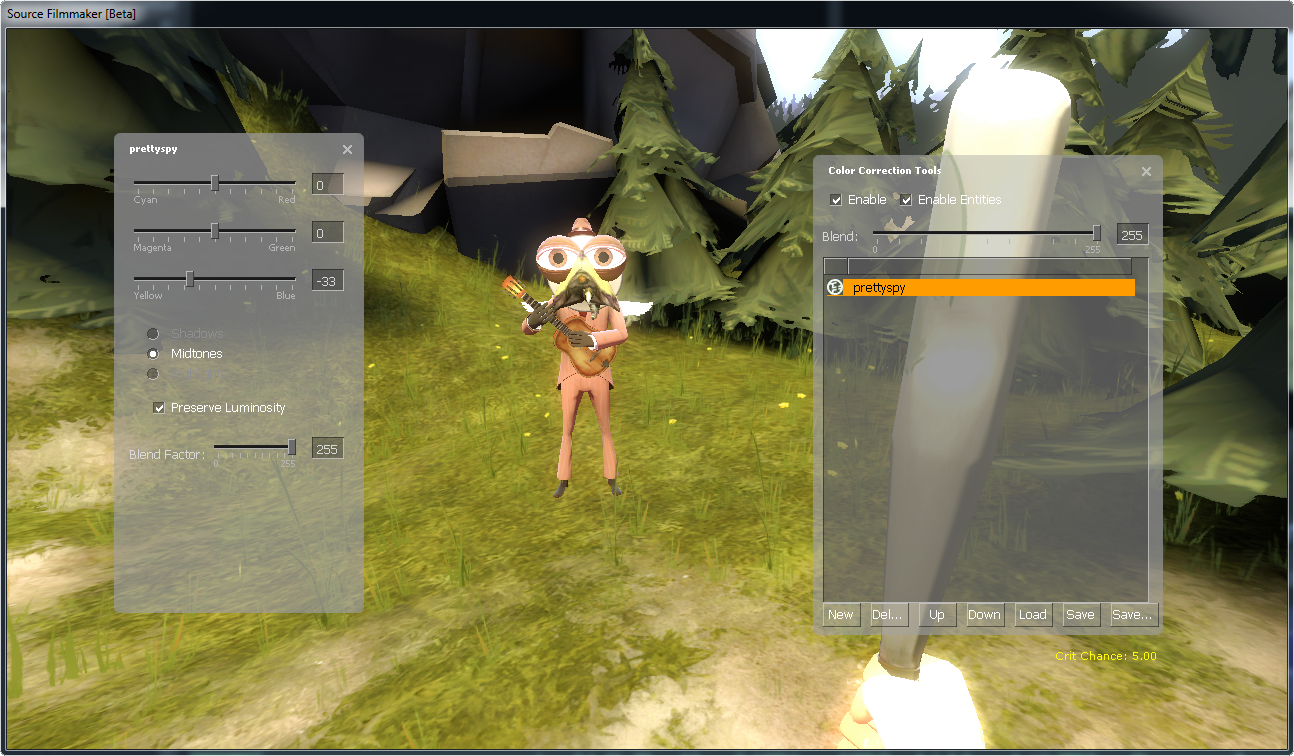
There, doesn’t it makes the image a little warmer? Now if we made it colder:
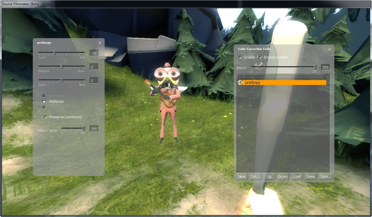
Brrr, but maybe he think it’s cool to chill out, so that’s good enough for him.
This tool is make most sense if you try it out yourself, but the baseline of this tool is that it amplifies one existing color while weakining the opposite color (in RGB at least).
Step 3: Save your Work
Okay, I’ve made my own color correction, what now?
Now it’s time to save it, so you can use it for Source Filmmaker.
How?
There is a “Save…” button bottom-right, but before you save it, uncheck the “Enable” checkbox, otherwise it will cause problems with Source Filmmaker.
Alright, “Enable” is disabled.
Now press the “Save…” function, you are now about to save a .vcc (Valve Color Correction) file. Right now you will find yourself in the “SourceFilmmaker/content/usermod/materialsrc/correction” folder. Move over to “SourceFilmmaker/game/tf_movies/materials/correction” folder and save it as “potato.vcc”.
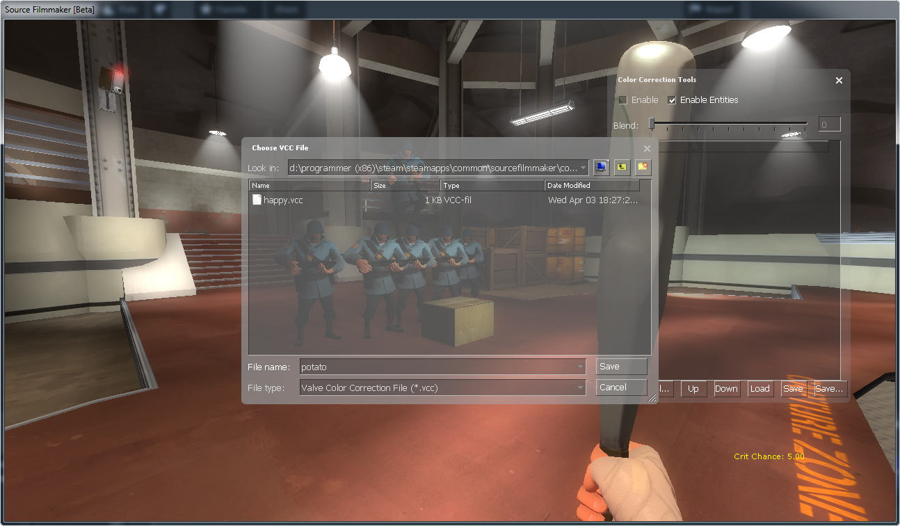
Why “Potato.vcc”?
Just so you know which one you’ve worked on, but you can call it whatever you want.
Great, now my game is frozen…
It takes several seconds to save the color correction file, give it about a minute to save it, otherwise shut it down.
Now the game asks if I want to perforce my color correction, what shall I do?
Just select no. Right now I don’t know what it means with perforce, and I’m not going to find out by poking around.
Okay it’s done saving, are we done with the color correction UI?
We’re done here, hit F11 and let’s move over to the final step.
Step 4: Setup your Color Correction
Now you’re going to setup your color correction. To do so, switch to the clip-editor.
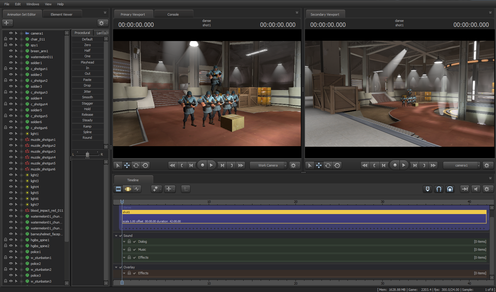
Now under the effects track, right click there and select “Add Clip to Track”.
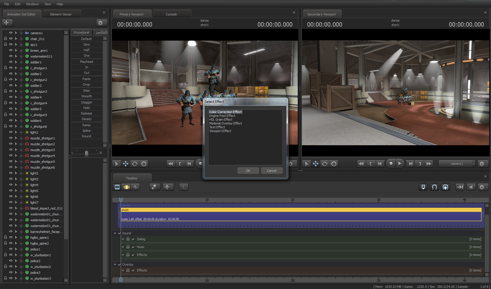
It now asks you for what kind of clip you want. As surprising as it sounds, select “Color Correction Effect” and press OK.

You now have a new clip, but no color correction yet. Drag both ends of the new clip so it occupies the entire shot.
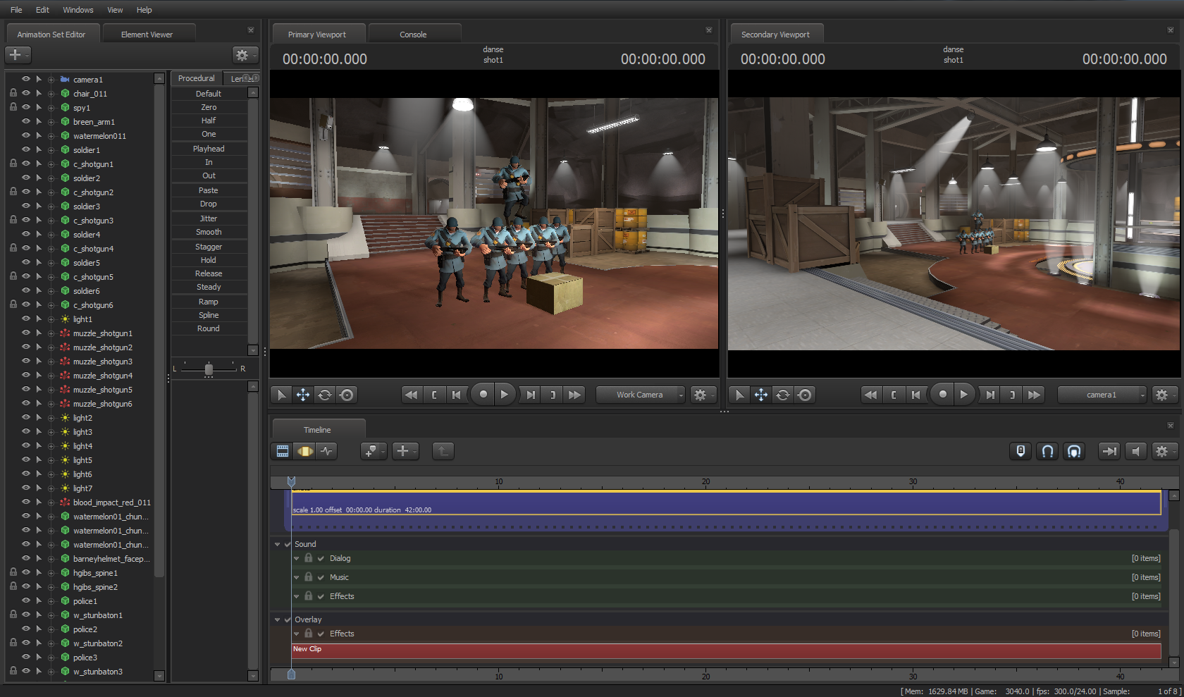
Now right click on the clip and select “Show in Element Viewer”. Remember that the Element Viewer is a dangerous place to explore, so hold my hand.
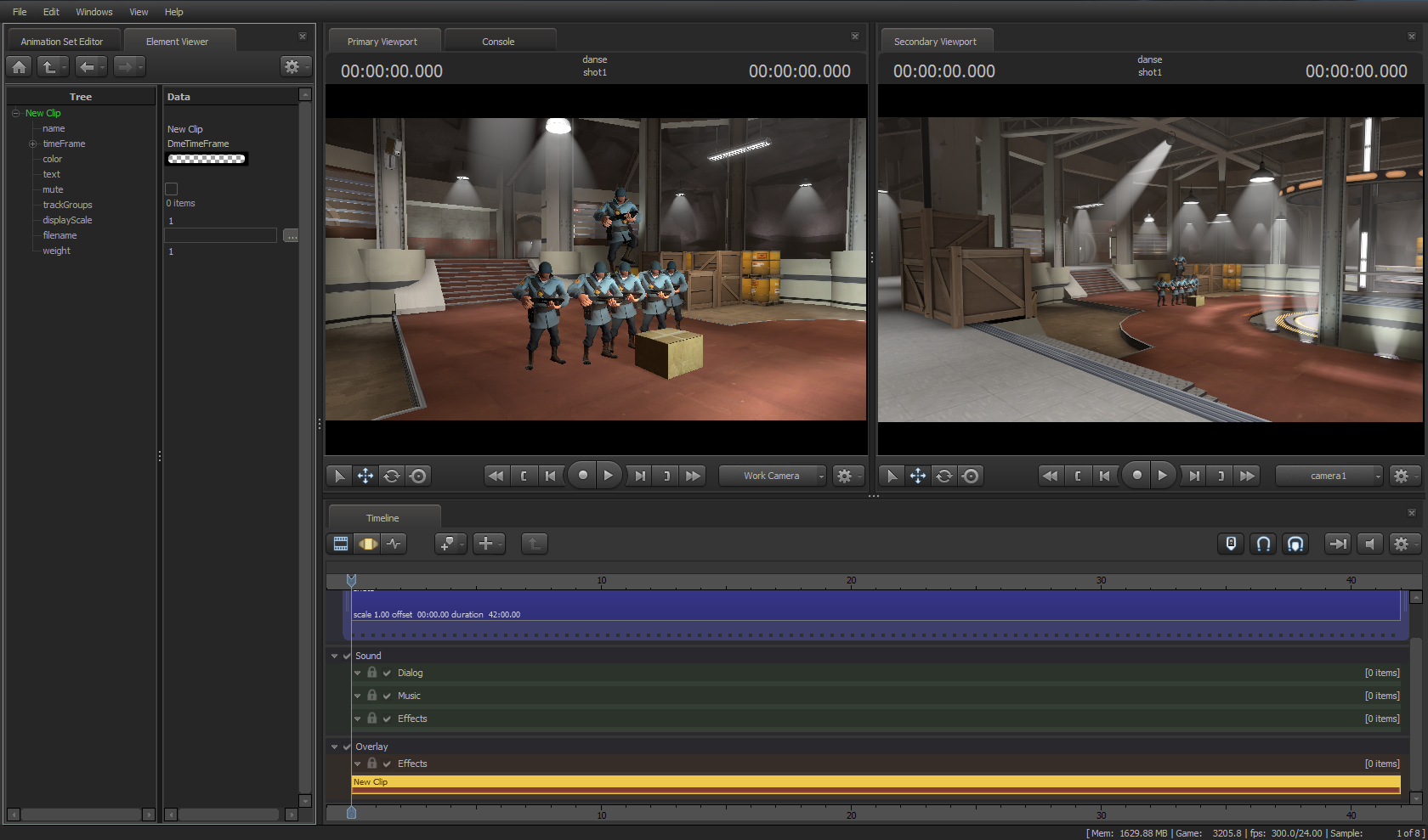
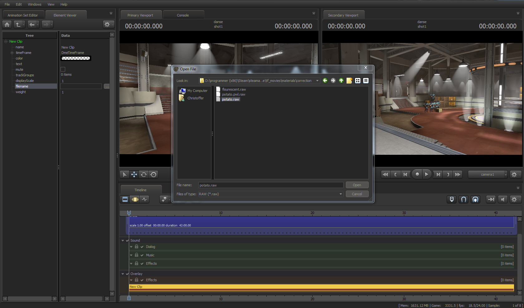
Next to “filename” there is a […] button, click on that and go to “SourceFilmmaker/game/tf_movies/materials/correction”, select “potato.vvc” and press “Open”.
That’s it! You’ve made your first color correction and applied it to Source Filmmaker.
If the viewports doesn’t update or are frozen, hit F11 several times until it starts working again.
Conclusion
In short, color correction in Source Filmmaker is rather weak compared to Photoshop or Premiere, but color correction is pretty much essential if you want your movie or image to look much more refined than when it’s left untouched.
I hope this guide has been useful to you, or has been a good read at least.
If you have problems regarding this guide, leave a comment here and I’ll see if I can answer (do be sure to check by to see if I answered).
If you try to create a specific effect, then I can’t help you with that, you’ll have to look it up on several websites or something.
If you need a video tutorial about how to do it, check out Jimer Lins’s video about how he did it.
Now I’ll be off, happy color correcting!

