Three-Point Lighting Tutorial
What exactly is Three-Point Lighting?
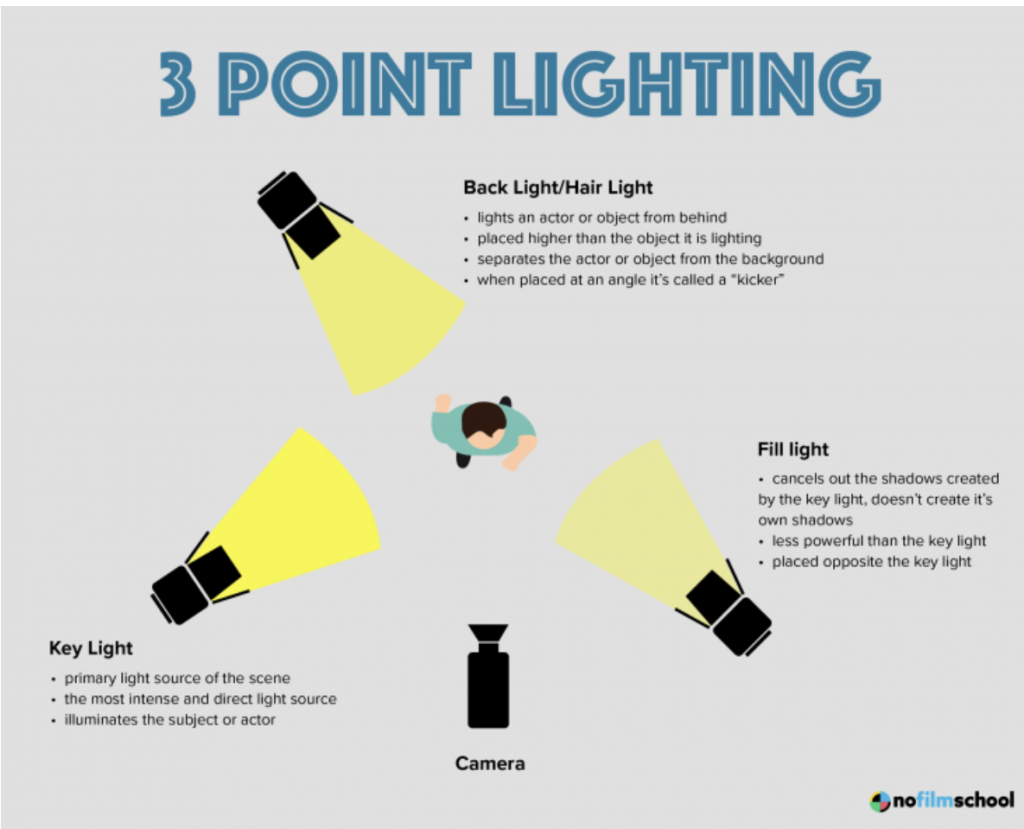
Bad Lighting vs Three-Point Lighting
Here, to kick things off, I will show you how much of a difference Three-Point Lighting makes compared to bad, very bad lighting.
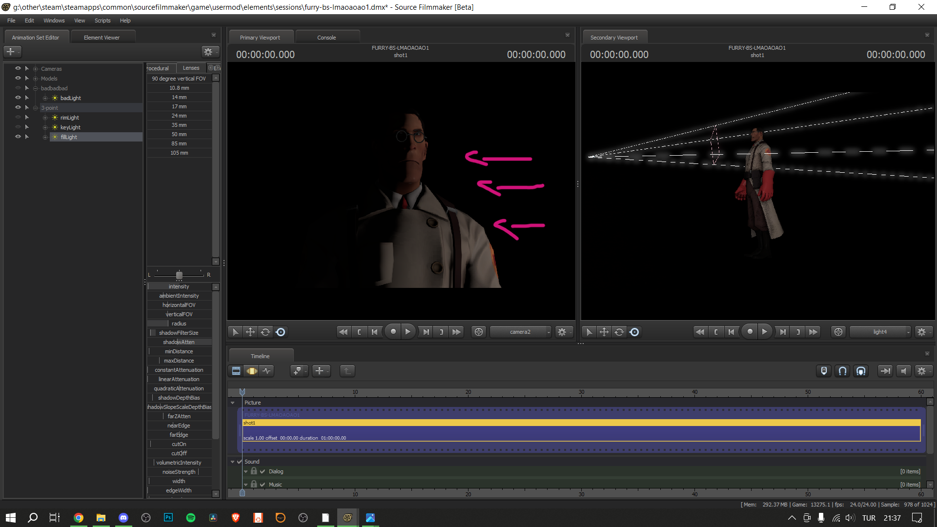
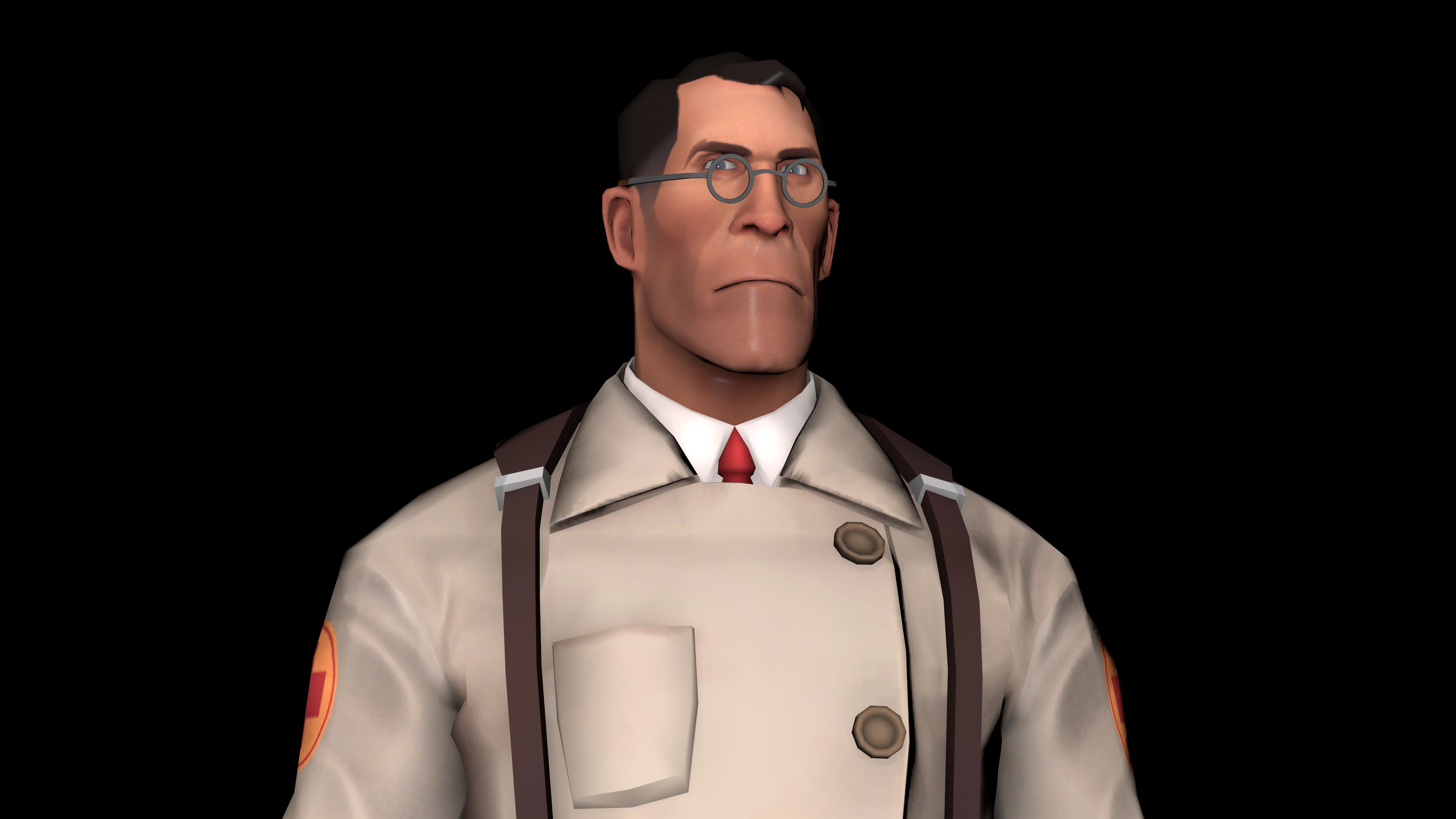 An instance of very bad lighting.
The one above is bad because the light is placed directly in front of the subject, so it completely eliminates the shadows and gives the image an artificial look. Other than that, there's no depth in this image, as almost every part of the image is so flat in lighting.
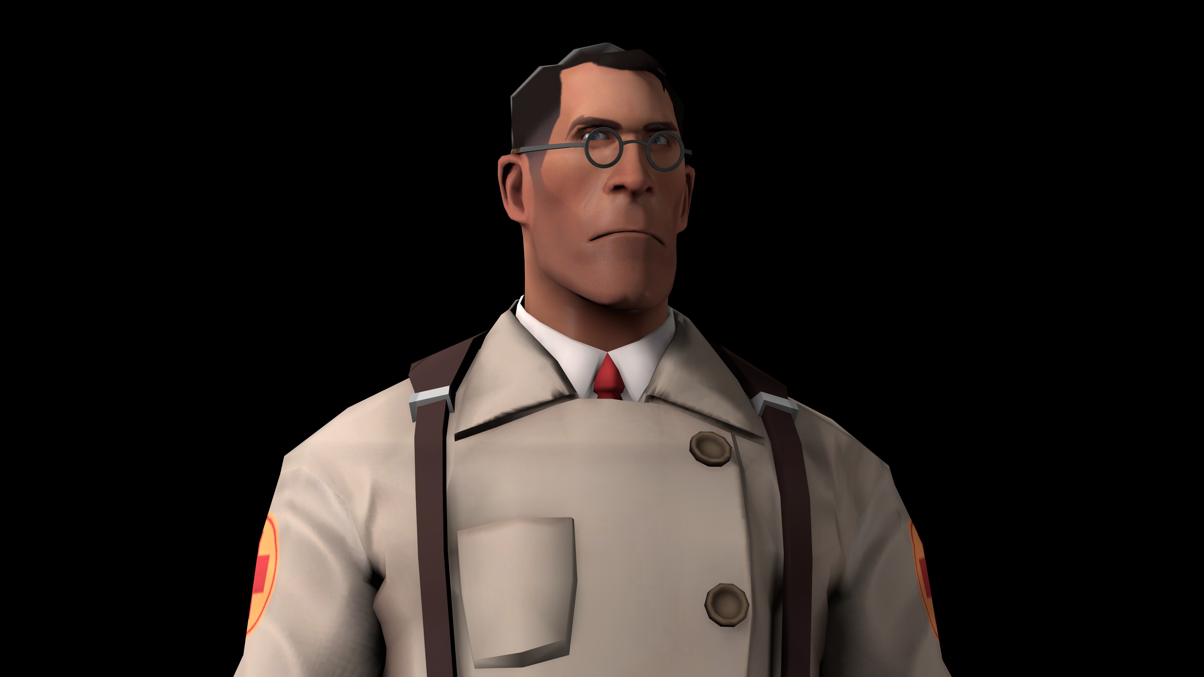 An instance of Three-Point Lighting.
This one is far better than the other, because of the proper lighting technique used. There's a lot of depth here in this image, thanks to Three-Point Lighting. Some parts are brighter, while some are darker, and part of the edges are even highlighted.
Detailed Explanation
Let me break it down for you, so you can understand better.
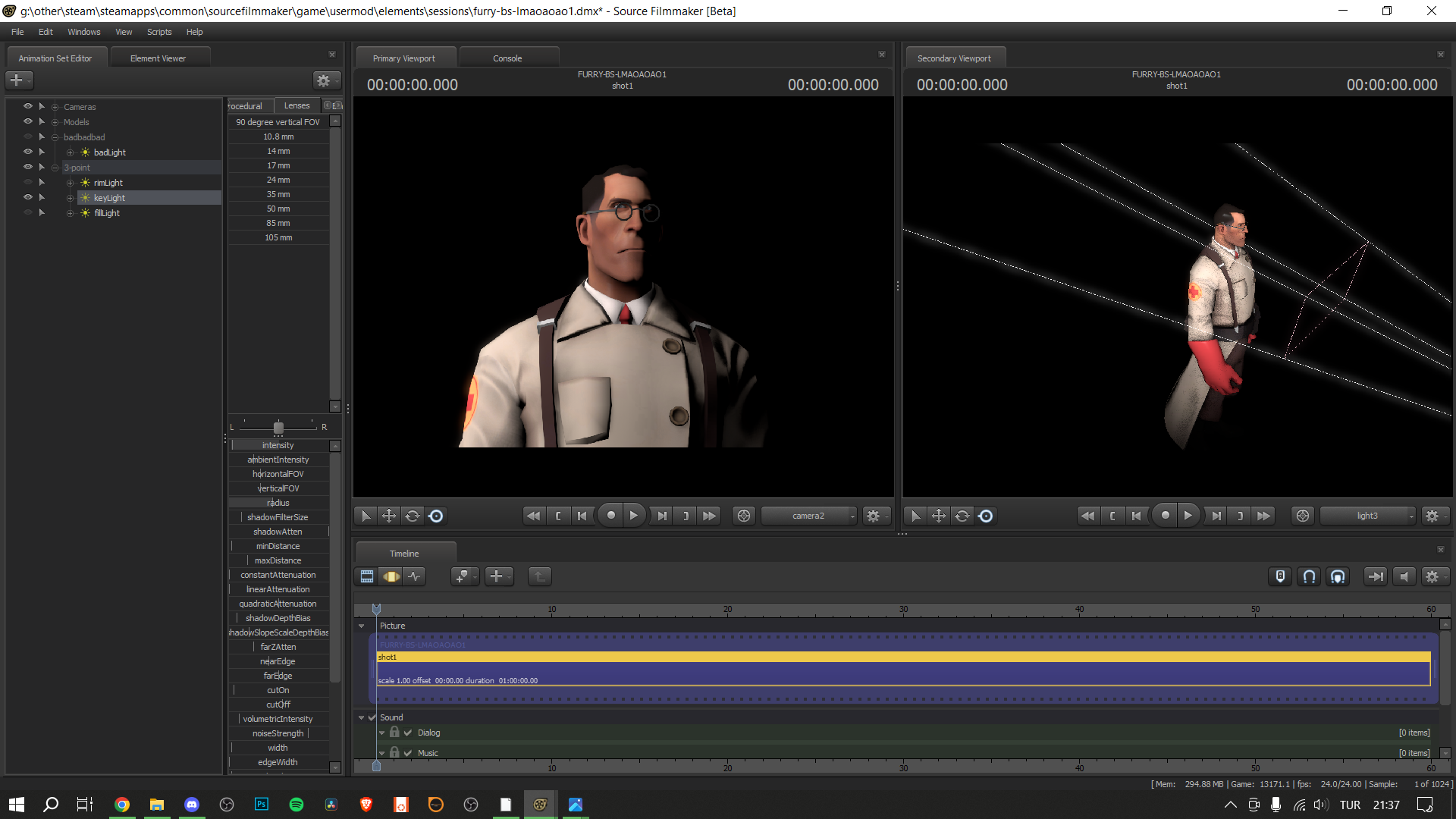
This is the Key Light. It is your brightest light, and is meant to be placed in a way that it covers around 2/3rds of your subject.
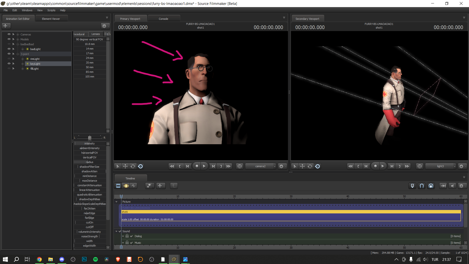
Key Light
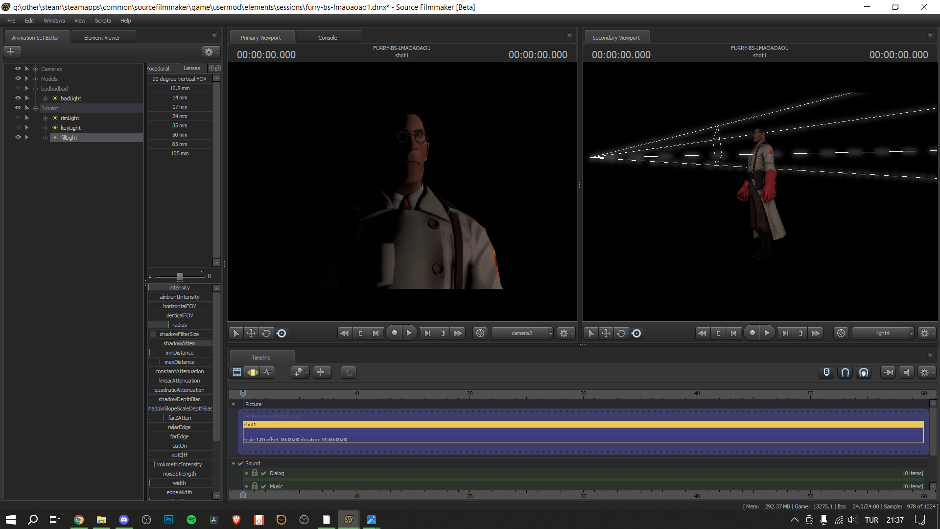
This is the Fill Light. It is around half as bright as the Key Light, and is placed on the opposite side of the Key Light, covering the rest of the subject.
Fill Light
This is the Rim Light. It is placed behind the subject, and its brightness can be adjusted depending on your theme and composition. It is used to highlight edges and give more depth to the subject.
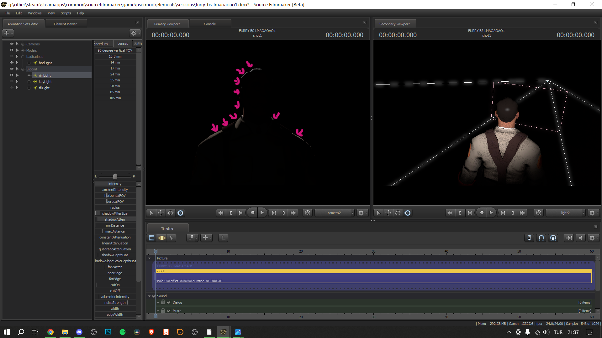
Rim Light
Combine all these and you get Three-Point Lighting!!!
Brief Summary
So basically, here's all you have to do, summarized.
Key Light: Your brightest light. Faces one side of the subject, covering around 2/3rds of it.
Fill Light: Half the brightness of the Key Light. Faces the other side of the subject, and covers the rest of it.
Rim Light: Its brightness can change according to the theme. Placed behind the subject. Adds depth to the subject.
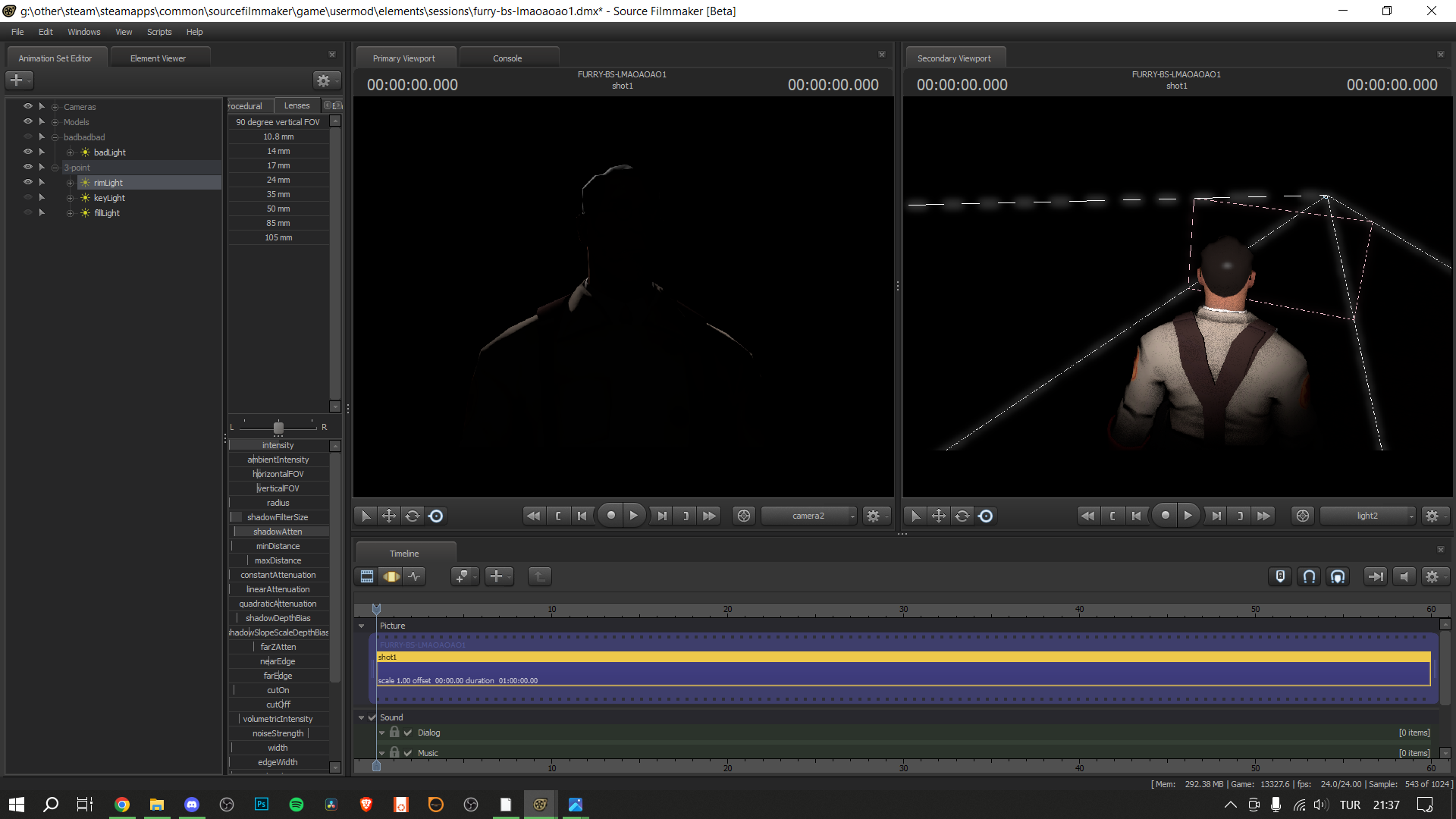
Tips and Tricks
Here are some of my personal tips and tricks for the subject matter.
- Increase the Radius slider on your Key Light and Fill Light.
It softens the shadows and makes the lights less harsh. - Decrease the ShadowFilterSize and ShadowAtten sliders on your Rim Light.
It makes the Rim Light appear more natural. - You can also place the Key Light just a little higher up, facing down. I think it looks very nice.
- This depends on your theme and composition of course, but it works most of the time:
In instances where you want to achieve natural/realistic lighting, keep the Rim Light dim. For more cartoon-ish looks, make the Rim Light bright and sharp. But like I said before, this completely depends on what you're going for. This is simply what I do most of the time.
Final Words
This is the second guide I've ever made. I tried to make it as comprehensible as possible for everyone. I hope you like it :D
Please do not forget to rate this guide and leave a comment. You don't have to do it, but I'd appreciate it if you did :)))
Thank you, and have a nice day!!! :D
- Changing Textures Using Material Overrides★ 5 (1.4k)41k views2.7k ♥5 minUpdated Jul 26, 2014
- Manually Updating TF2 Content★ 5 (1.3k)35k views1.9k ♥2 minUpdated Nov 26, 2025
- The Fundamentals of SFM: For Beginners★ 5 (1.3k)25k views3.3k ♥55 minUpdated Apr 29
- Ваш первый постер★ 5 (1.1k)22k views2k ♥5 minRussianUpdated Oct 22, 2024
- Getting Gmod Workshop stuff too SFM★ 5 (510)15k views1.3k ♥1 minBulgarianUpdated Aug 4, 2015
- Animation Guide★ 5 (704)14k views1.9k ♥6 minUpdated Apr 9, 2023



- Upgrading to PremiumTeam Fortress 2★ 5 (20k)1441k views11k ♥6 minUpdated May 11, 2022
- No More Room in Hell Official ManualNo More Room in Hell★ 5 (2.8k)569k views2.1k ♥29 minUpdated Apr 22, 2019
- NMRiH Community Hosting GuidesNo More Room in Hell★ 5 (526)351k views653 ♥1 minUpdated Aug 10, 2022
- ULTIMATE GUIDE FOR GAME DEV TYCOONGame Dev Tycoon★ 5 (5.8k)326k views10k ♥4 minUpdated 23 Jan, 2014
- How to 'Git Gud' Soon™MORDHAU★ 5 (2k)318k views3k ♥68 minUpdated Nov 16, 2024
- Лучшие кооперативные игры SteamPAYDAY 2★ 5 (1.5k)315k views2.1k ♥56 minRussianUpdated Apr 27, 2025



This guide was created by its original author on the Steam Community. Are you the author and want it removed? Request removal.